Digital Access: Forms
Transcript
Made automatically from the video's sound, so it may contain mistakes. Click a line to play from there.
Right, welcome to today's explainer, where we're taking complex web standards and transforming them into practical everyday engineering techniques for absolutely frictionless accessibility. I am thrilled you're here.
Today we're skipping the theory and diving straight into the actual code and mechanics that make the web usable for absolutely everyone. Having engineered resilient contrast, 400% reflow, plain language, and humane timers, we're now shifting our focus to the user's path of least resistance.
We're going to apply semantic precision and cognitive calm to the exact places where task completion ultimately succeeds or fails. Forms, validation, and authentication across operations desk and pathway. So here's the plan for today.
We'll be looking at semantic form foundations, the placeholder text pitfall, handling errors gracefully, frictionless accessible authentication, and finally native controls and disclosures. Okay, let's jump straight into chapter one.
We'll start with how native programmatic associations, like the label for attribute, not only connect text to inputs, but actually physically enlarge motor click and touch targets. And when it comes to grouping things like radio buttons, checkboxes or dates, the native field set and legend are non-negotiable.
During a paid co-review, a daily NVDA and Jaw's screen reader contributor demonstrated this perfectly in forms mode. A broken, arbitrary div structure literally just reads out edit text, blank, invalid entry.
Absolutely useless, right? But a native field set and legend announced the group's purpose crystal clear. Notification preference, group, email updates, radio button one of two. Now, what about extra instructions?
That's where ARIA described by comes in. This attribute safely connects persistent hints to your inputs without hiding them, ensuring assistive technology reads the hint immediately after the label. Instead of burying instructions, we chain them.
So if you're zooming in at 400%, say, on a 320 CSS pixel viewport, you get a beautiful single column stack. Label on top, then the hint, then the error, then the input. No clipped native validation bubbles, no wide right-align gutters.
It just works. And we can't talk about foundations without mentioning WCAG 1.3.5 and autocomplete tokens. By leveraging proper autocomplete attributes, you drastically reduce both motor and cognitive load.
It allows the user's operating system to instantly surface those autofill bars for email addresses or one-time codes. Plus, it completely restores voice control commands like tap institutional email. The placeholder text pitfall.
We really need to banish the disappearing placeholder as label trap. Using a placeholder as your only label creates a frustrating vanishing act for users with cognitive or memory conditions. Literally, the second you start typing, your instructions vanish.
If you get distracted or have short-term memory challenges, you actually have to delete your own input just to remember what the field was asking you for. We need clean required versus optional conventions with persistent top labels instead.
Furthermore, browser default placeholder styling almost always fails the WCAG 1.4.3 minimum contrast ratio of 4.5 to 1. It's usually this light, washed out grey. If your operations desk relies on vanishing 2.3 to 1 placeholders, they are practically invisible to low vision users.
We have to replace those with a persistent top label and a clear hint. Handling errors gracefully. Disabling a submit button creates a dead end that traps users without any explanation whatsoever.
We saw this firsthand during a review with a motor and tremor contributor. They spent incredibly valuable energy repeatedly clicking a disabled button, completely unaware that a missing field further up the page was silently blocking them. Just let them submit and then clearly tell them what went wrong.
Instead of a disabled button and read-only error borders, we need to provide a guided recovery path, like the gov.uk style. Step one, the user submits. Step two, we dynamically move keyboard focus to a high contrast top error summary container, using tab index equals minus one and roll equals alert.
Step three, we provide in-page links in that summary that jump the user directly back down to the inline mistakes. Down at the field level, setting aria hyphen invalid equals true flags the error programmatically.
You then chain it using aria hyphen described by to both the hint ID and the error ID. But listen, calm validation timing is absolutely crucial here. Avoid premature on-input nagging whilst someone is literally still typing their email address.
Wait until they leave the field or submit the form before you evaluate it. Right, let's dive into chapter 4. Frictionless accessible authentication. Specifically WCAG 3.3.8 and 3.3.9.
This is where we implement cognitive test-free sign-in. Forcing a user to solve a six-tile puzzle capture, or transcribe a one-time code from an SMS entirely from memory, places an impossible burden on users with cognitive disabilities.
During a session with a dyslexic and neurodivergent contributor, splitting a passcode across six separate little boxes created a massive friction. Switching to a single input with autocomplete equals one-time code, or better yet, using WebAuth pass keys via face ID or fingerprint completely eliminates this cognitive obstacle course.
And please never actively block a user from pasting their password. Writing JavaScript that says on paste equals return false is a direct whackhag failure, F109 to be exact. It severely punishes people using password managers, which are vital assistive technologies.
We need unrestricted paste, autocomplete equals current password, and simple show hide password toggles. Finally, chapter 5. Native controls and disclosures.
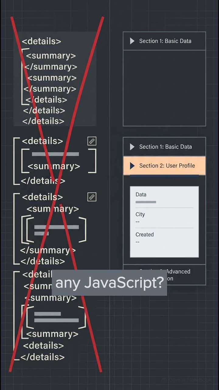
No ARIA is better than bad ARIA. Comparing native elements, like select, input type equals checkbox, and the details disclosure element against fragile custom div rewrites is night and day. A native details and summary tag pair gives you keyboard support, native twisty states, and screen reader grouping straight out of the box.
If you try to rebuild a select menu with divs, you end up with a component that skips the tab key entirely, and you have to manually script the enter key, spacebar, and focus management. Save yourself the massive headache and just use the native platform.
So as we wrap up this explainer, I highly encourage you to take our 5.4th checklist and do a refactor exercise on your own operations desk or sign in flow. Check your label associations, remove those disabled submit buttons, test your error summaries, and verify that password pasting actually works.
This sets us up perfectly for our next session, S10E05, where we'll be tackling dynamic interfaces and mobile apps. But I'll leave you with this final thought. If you audited your own app's sign inflow right now, using only a keyboard and a screen reader, honestly, how much friction would you actually find?