Accessible Content & Media
Transcript
Made automatically from the video's sound, so it may contain mistakes. Click a line to play from there.
Welcome back, designers, content authors, front-end engineers, and vibe coders. Let's get straight into it with a very quick recap. In our last explainer on dynamic interfaces and mobile apps, we unified our single-page application routing, we implemented polite live regions, built native models, and achieved mobile touch parity across our app shells.
Honestly, fantastic work all around. But now, now we need to look at the actual substance of our applications. We're going to make the rich content inside our pathway and operations desk platforms, the images, the state diagrams, financial tables, video lessons and documents, genuinely equivalent for all of our users.
Now, we are keeping things tightly focused today. Digital accessibility is obviously a massive subject, so we're going to explicitly hand off some of the really complex interactive elements, like interactive SVG chart navigation, OKLCH pattern double encoding, and web audio sonification straight into our upcoming companion lab S10.11.
Today is all about getting those foundational rich media elements exactly right. So here is our playbook for today's Accessibility Tree Mechanism Explainer. We're covering four distinct chapters engineering equivalent graphics, responsive semantic data tables, synchronized time-based media, and HTML first documents and testing.
Right, chapter one, engineering equivalent graphics and implementing the WAI alt decision tree. Let's dive in and fix the visual content across pathway and operations desk. Imagine this scenario for a second.
Our blind screen reader engineer encounters a totally unexplained pathway state machine diagram whilst navigating the app. The screen reader just reads out a useless file name. It's a broken experience.
So how exactly do we decide what alternative text to provide? Well, it all boils down to asking yourself this core question. Does this image contain text? Does it serve a specific function, or does it contribute contextual meaning?
To answer that, the W3C Web Accessibility Initiative gives us this brilliant routing tree with three clear paths. First, if an image is just purely decorative, use an empty alt attribute, literally just alt equals bracket comma.
So assistive technologies simply ignore it, saving the user from a load of audible clutter. Second, for functional icons, you label the exact action or destination. And third, for informative graphics, like those complex state diagrams we mentioned, we need a two-part approach.
A concise alt text, identifying the image, plus an adjacent structured summary containing the actual data. Responsive semantic data tables, featuring accessibility expert Adrian Roselli's CSS and HTML fix.
Let's look at a really common mobile responsive CSS trick that completely destroys accessibility. Have a listen to the verbatim screen reader output on our operations desk cohort financials when things go wrong.
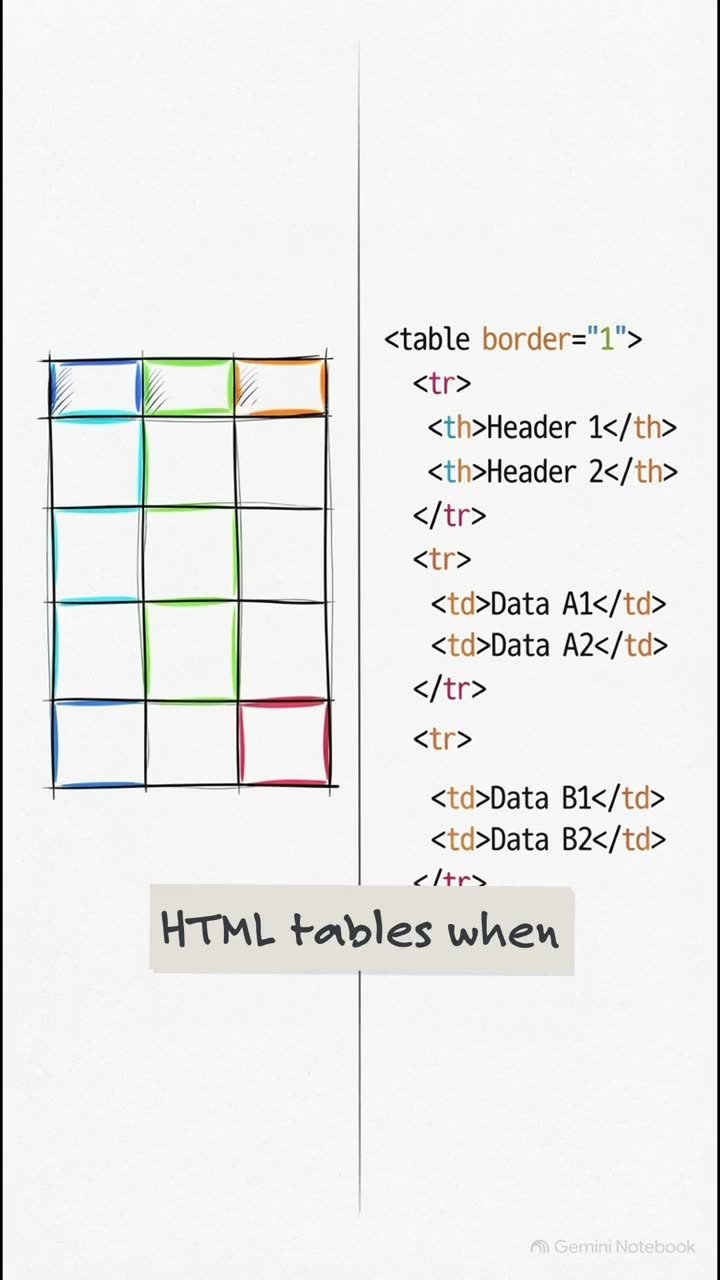
When a screen reader hits a naive CSS display colon block property, which developers love using to squeeze wide tables onto a 320 pixel mobile screen, it completely erases the column headers. The user just hears disconnected data cells like 14,200 cell, with zero context.
But over on the right, with a fixed semantic table, it successfully announces the coordinates. Row 2, cohort alpha, tuition revenue $14,200. It is an absolute night and day difference for usability.
So instead of stripping those crucial table semantics with display colon block, Adrian Roselli shows us a much better way. We simply wrap the completely valid HTML table in a focusable scroll region. This way, keyboard users can navigate left and right natively and the table remains fully intact for screen readers.
This quote perfectly explains why the Rapidiv preserves the native table element without overriding its semantics. Roselli notes that assigning role equals region creates a generic landmark, and using overflow auto satisfies the WCAG reflow criteria, preventing the entire page from having a messy two-axis of scrolling.
To implement this brilliantly simple solution, you just need a specific attribute combination on your wrapper. Apply role equals region to establish the landmark, add tabindex equals zero, so a keyboard user can actually focus on and scroll the area, then use ARIA labeled by to give that region an accessible name, usually pointing to the table's caption, and finally, overflow auto to prevent clipping for users who zoom their screens all the way up to 400%.
Alright, chapter 3. Synchronized time-based media and fixing the WebVTT HTML track element. What's really fascinating here is analysing the video lessons on our pathway app through the lived experience of a deaf UX researcher.
Our researcher demonstrated that relying purely on raw auto-generated captions creates a frustratingly broken visual modality. Just look at this. The automated system mangled the technical term WCAG ARIA sort into Wii gag area sort, and it provided absolutely zero speaker labels.
I mean, imagine trying to learn front-end development when the captions are literally giving you nonsense. The fix here is using human-edited Web VTT closed captions, which perfectly identify both the technical terms and the specific speaker.
To implement this properly, MDN Web Docs guide us to use the HTML track element. You simply specify the kind attribute depending on what you're delivering. Captions include dialogue plus important sound effects. Subtitles handle translations.
Descriptions provide a text track that can be synthesized into audio to describe visual actions for blind users, and chapters help everyone navigate through longer media resources. By applying these fixes, we dramatically elevate the user experience.
We replace those awful, unfocusable custom video buttons with native button controls, featuring a generous 44 by 44 pixel touch target. We give keyboard users native controls, we add brilliant warning chime sound cues into our Web VTT files, and we properly identify speaker spans.
We can also provide a clickable interactive transcript right below the video, ensuring it stacks cleanly, even on tiny mobile screens. HTML first documents and our crucial five-modality testing checklist. It's time to talk about ditching those remediated tagged PDFs.
HTML first publishing means authoring your documents primarily in structured HTML, using proper heading levels from H1 to H6, semantic table scopes, and ensuring a strictly logical reading order. Trying to retrofit accessibility into a PDF is often a messy artifact-heavy nightmare.
Authoring in HTML first guarantees a robust accessibility tree mechanism right out of the gate. Now to make absolutely sure our app shells are genuinely equivalent, you have to run this precise five-modality testing checklist on your annotated code repairs.
Visually verify those captions and transcripts. For keyboards, test that you can reach every native button and scroll your tables. With a screen reader, validate those table cell coordinate announcements. Test at a 400% zoom to ensure your transcript still stacks cleanly at 320 CSS pixels.
And finally, for mobile and voice control, ensure you've actually named those unlabelled SVG media icons. So a user can simply say, tap captions. I want to leave you with this final provocative thought.
Pull up your current app shell right now. Can it actually survive the 400% zoom test without completely destroying its semantic structure or pushing critical content off screen? Ask yourself this exact question.
Test it out on your own builds, and we will dive even deeper into auditing and user research in our next explainer, S10E07. See you then.