React Accessibility
Transcript
Made automatically from the video's sound, so it may contain mistakes. Click a line to play from there.
Welcome back to The Explainer. So, having established our cross-functional product governance and CI gates in the core finale, we are now entering our very first engineering companion lab. We're here to cure those specific accessibility anti patterns that are routinely created by JSX, React re-renders, SSR hydration, and frankly, unguided AI component generation.
It's time to get our hands dirty. We've got a brilliant, tightly focused agenda today. We'll be running through our intro to the companion lab, three classic React accessibility bugs, the five modality lab refactor, headless primitives versus hand rolled, modals, portals, and live regions, and finally, roll first testing and rules.
Let's crack on. Right, section one, intro to the companion lab. From governance to engineering. As we transition from product governance into the code base, we are skipping the basic fluff today.
We're jumping straight into curing those broken interfaces, often shipped by vibe coders steering AI agents in React and Next.js. We need to look at how real people actually navigate digital products, and crucially, how to fix the underlying markup.
Three classic React accessibility bugs. This is all about what happens when a pixel perfect design completely hides a brittle DOM. Now, look at this first trap.
It perfectly highlights the deception of AI CodeGen. Slapping an on-click handler onto a generic div creates a completely unreachable black box for anyone not using a mouse. You are stripping away the implicit role, the tab index, and the native enter and space keyboard synthesis.
Just swap it for a native button element. You get all that click event firing and proper semantics straight out of the box. Here's our second classic bug, and it's a bit of a shocker. Unstable keys.
Using something like math.random for a key or defining components inline will actually remount your input's mid keystroke. Do you know what that does? It completely wipes the active DOM focus, silently destroying a keyboard user's navigation flow during a re-render.
You absolutely must maintain stable keys and deterministic states. Bug number three is the hard coded ID collision. Imagine you hard code an ID like assign E help on a form field, and then you render that field three times on the very same page.
Your ARIA labels are going to collide disastrously. The fix React's Use ID hook. It dynamically generates unique ID strings that are perfectly stable and deterministic across server-side rendering and hydration.
It's an absolute lifesaver. The five modality lab refactor. This is where we translate empathy directly into the DOM. We are now running our broken operations desk filter combo box and pathway lesson note fields through five human modalities.
Visually, we need collision aware primitives and high contrast focus outlines. For keyboard, robust arrow traversal and escape triggers. For screen readers, rich semantic HTML and ARIA. For 400% zoom, viewport clamped popovers.
And for mobile voice or switch users, proper 44 by 44 pixel target sizes and press normalized hooks. We have to handle the whole shebang. Let's look closely at the keyboard flow.
We have to completely rip out those unreachable div triggers and focus dropping keys. We're replacing them with proper tab entry, inline filtering, arrow up and down option traversal, enter for selection, and escape to reliably trigger focus return.
We are turning a focus trap into a genuinely usable tool. The true cost of broken markup hits home when you listen to the verbatim speech output. The broken JSX soup just stutters out.
Clickable. Assign incident. Group. John Rivera.
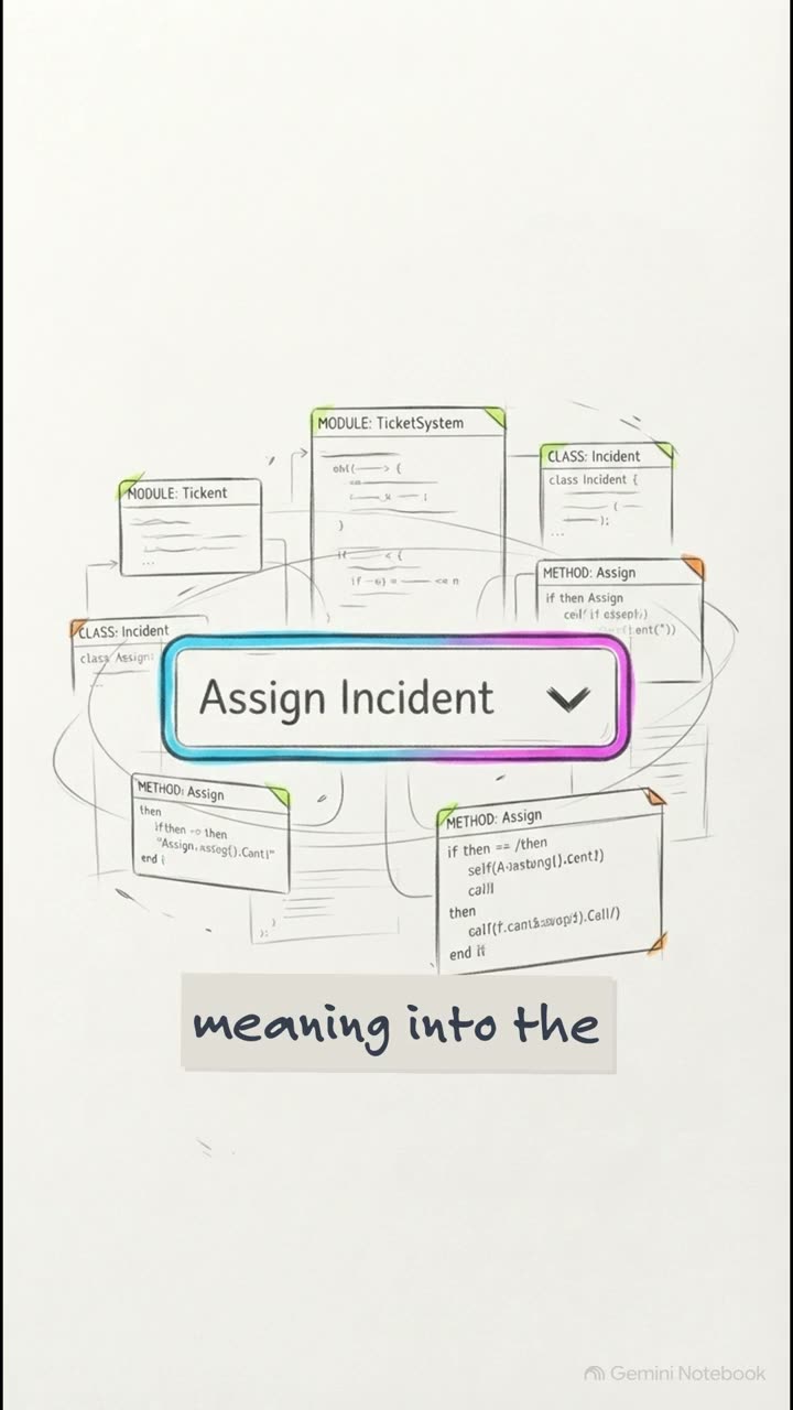
Clickable. It's totally confusing. But our fixed wired combo box, it smoothly announces assign incident, combo box, collapsed, has pop-up listbox.
Type Riv. Two results available. John Rivera, one of two. Option.
It tells the user exactly what's happening. Now, for our low vision users navigating at 400% zoom, which scales things down to a 320 CSS pixel width, rigid heights and overflow hidden are a disaster. They literally clip option chips right off the screen.
We fix this by pivoting to min height flex wrap containers and viewport clamped popovers. This preserves the entire interface, even at maximum magnification. Headless primitives versus hand rolled.
It's time to work smart with tools like Radix and React ARIA. Let's be honest. The Radix slot primitive using the asChild prop is a total game changer. It cleanly merges your styles, your refs, and your ARIA strings directly onto an immediate native node.
This means you avoid illegal HTML nesting entirely, like accidentally shoving a button inside an anchor tag, whilst keeping all your complex logic bound to the right semantic element. So here's the choice.
Are you going to write and maintain over 400 lines of fragile WAI-area state machine logic for a single combo box? No way. Headless primitives from React Aria and Radix automatically handle type ahead, pointer cancellation, right to left arrows, and mobile trays deterministically straight out of the box.
Frankly, we need to stop writing fragile custom JSX from scratch. Models, portals, and live regions. Let's see how we handle escaping the standard DOM flow. Building a truly robust modal means coordinating a few moving parts to avoid CSS overflow conflicts.
First, use React's Create Portal to float the UI above the layout. Second, trigger the native HTML show modal API on a dialog element to get those built-in browser behaviors like hitting escape to dismiss. And crucially, third, apply the inert attributes to your background subtrees.
This strictly locks down any accidental interactions outside your active modal. When you're building dynamic notifications, you want them to be helpful, not annoying. Combining role equals status with ARIA LivePolite on a container maximizes cross-browser compatibility.
It guarantees that dynamic content changes are announced by screen readers without aggressively interrupting the user mid-task. And please, whatever you do, don't spam live regions on every single React re-render.
It completely overwhelms a screen reader. Instead, we build a pre-mounted singleton use announce hook. This polite live region hook debounces rapid filter keystrokes into one single clean, concise result count announcement.
It's a much smoother experience. Finally, section 6, roll first testing and rules. This is where we secure the CI pipeline. To stop regressions creeping back into the code base, we're laying down the law.
We are enforcing static AST checking on JSX elements. We're banning get by test ID crutches and enforcing testing libraries get by roll. We're running automated checks with GestAxe in Vite Est, integrating Axe Builder for end-to-end testing in playwright, and hard coding these architectural mandates right into our agents.mdai rules file.
Your coding assistants need to know the boundaries. Just to put this into perspective, the ESLint plugin JSX A11Y package has over 3,600 stars on GitHub. It is the absolute industry standard for stopping broken markup before it even gets a chance to reach the DOM.
So here's the big question to leave you with today. If we've successfully cured the DOM with semantic native elements, headless primitives and strict CI rules, how do we elegantly guide users through complex multi step custom components without them completely losing their place?
Well, now that our underlying markup is rock solid, we are perfectly primed for our next explainer. Join us next time for our companion lab on focus management and roving tab index. Cheers for sticking with me today, and I'll see you in the next one.