Native Accessibility
Transcript
Made automatically from the video's sound, so it may contain mistakes. Click a line to play from there.
Welcome back everyone to the season 10 finale explainer. I am absolutely buzzing to have you here at our engineering lab workbench for this culminating session. Over the past few weeks, we've been dismantling and rebuilding interfaces to see how they truly function under the hood.
And today, well, today we are taking everything we've learned and applying it to the ultimate test, native mobile environments. So let's jump right in. Having engineered accessible web components, focus, choreography, and data visualizations across labs 1 to 3, our final companion lab brings the exact same five-modality discipline to native iOS Swift UI and Android Jetpack Compose.
Now, since you're already familiar with the core principles, we are skipping the basic definitions entirely today. We're going straight into the native code APIs. Here's the syllabus for today's masterclass.
One, the native accessibility tree. Two, fixing the five modalities, three, roles, traits, and focus. Four, automated audits and CI, and finally, number five, the series synthesis. Right, let's kick things off with section one.
The native accessibility tree, coalescing the UI. When you transition from the web DOM to native mobile, how views actually group semantic information is arguably the first major hurdle. Just think about the sheer user friction here.
Take a typical native lesson card view with five subviews. You've got a Sparkles icon, the text module 4, the title, Semantic HTML, a Progress View sitting at 0.75, and a bookmark button. Now, if you leave these as ungrouped leaf nodes, a screen reader treats every single one of them as an individual stop.
That literally forces a user to make five disconnected swipes just to read a single card. If they want to navigate past five cards, they're swiping 25 times. It's exhausting.
But by applying Swift UI's.accessibility element with combine, or Jetpack Compose's merge descendants semantics modifier, we completely coalesce that entire card into a single coherent semantics stop, one swipe. It's a massive usability upgrade, and it literally just takes one line of code.
Moving on to section two. Fixing the five modalities, a practical workbench. Okay, so with our tree beautifully coalesced, we need to repair our component across all five modalities, starting with visual and touch.
Consider a really brittle implementation. Hard-coded 14-point or 14 dP text, line limits completely locked to a single line, and these tiny 24 by 24 icons. If a user changes their system font size, this layout simply breaks or truncates.
It's a mess. Contrast that with the fix. We abandon those rigid hard-coded values for semantic typography, like dot headline and dot body, which inherently respect user preferences.
For iOS icons, we wrap their size in an at-scaled metric property wrapper, so they actually grow proportionately with the text. And we're also making sure our touch targets are at least 44 by 44 points on iOS and 48 by 48 DP on Android, guaranteeing they are effortlessly tappable.
Next up, let's look at the screen reader modality. Just imagine the sensory shock for a voiceover or talkback user encountering a completely broken output. Swipe 1, Sparkle's image, swipe 2, module 4, swipe 3, semantic HTML.
It's fragmented, it's repetitive, and it completely lacks context. Plus, any swipe to reset gesture is entirely hidden from the user. Now, look at the fixed output. We've overridden that fragmented speech to provide a smooth, coherent narrative.
It simply reads, semantic HTML, module 4, 75% complete, bookmarked button. And crucially, it announces Actions Available, which gracefully exposes our hidden reset gesture right there. For our scaling modality, we absolutely must consider extreme text enlargement.
When an iOS user activates dynamic type at AX5, or an Android 14 user cranks their non-linear SP up to 200%, a rigid horizontal layout, like a fixed 64.8 stack or row, will just completely crush the text into unreadable fragments like SEMAN.
The solution here is to let the layout adapt. In Swift UI, you'd use a view that fits with a horizontal constraint, or check the is accessibility size environment value. Over in Compose, you check if the font scale is greater than or equal to 1.5.
When those specific thresholds are met, we programmatically flip our layout from a horizontal row to a vertical column. It gives the text all the vertical space it needs to breathe. Keyboard, voice, and switch access.
We have to replace those generic tap gestures with native semantic buttons, like SwiftUI's button or compose's clickable modifier, simply because generic views get entirely skipped by keyboard navigation. For voice control, we add accessibility input labels, meaning a user can literally just say, tap semantic HTML to trigger the card instantly.
And for switch access, well, instead of forcing a user to painfully tab through tiny nested buttons, we expose hidden behaviors, like reset progress, directly to the system menu using custom accessibility actions. Now for section three.
Roles, traits, and focus. Translating ARIA to native. If you're coming from the web world, you're probably very used to ARIA attributes. Well, think of this as your ultimate cheat sheet for translating those familiar web standards directly into Apple and Google's proprietary native APIs.
For instance, when you want a roll of button on the web, in SwiftUI you use dot accessibility add traits.isButton, and in Compose, you assign roll.button within a clickable or togglable modifier. For states like ARIACurrent or toggled values, SwiftUI uses dot is selected or.accessibility value, while Compose reads out the state description.
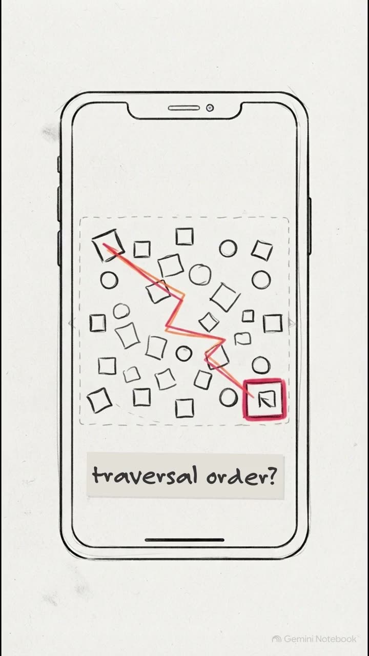
And what about managing focus order, the equivalent of ARIA owns. Swift UI utilizes the accessibility focus state property wrapper, whereas Compose relies on isTraversal Group and TraversalIndex to steer the screen reader exactly where you need it to go.
Now, focus management also means truly respecting the user's current context. When a background event happens, the last thing we want to do is violently hijack their screen reader focus. Instead, we use polite updates.
On iOS, we push an accessibility notification announcement, and on Android, we define a container with a polite live region mode. This gracefully alerts the user to the update at the very next natural pause, totally avoiding interrupting their current task.
Section 4. Automated audits and CI, locking in the guardrails. So we've nailed the manual implementation, but let's be honest, manual fixes tend to regress over time.
The absolutely crucial point here is that testing must be automated. Here are three concrete steps to gate your mobile pull requests. First, on iOS, drop a try app.performaccessibility audit command into your XCUI tests.
It'll instantly flag contrast issues and missing labels for you. Second, on Android, add enable accessibility checks to your compose test rule to evaluate your semantics tree against real-world rules. And third, since we are increasingly using AI to write code, make sure you lock these API preferences, like always preferring semantic buttons over tap gestures straight into your repository's agents.md file.
That way your AI is assisting you in building inclusively by default. And finally, section 5, the series synthesis Digital Accessibility Arc. We have officially reached the culmination of this incredible 13-notebook arc. From our very first core episode, right through to this final companion lab, this central quote has been our guiding star.
We didn't just sit around and read about whackag guidelines. We experienced how real people actually navigate digital products. We navigated the web DOM with a keyboard. We meticulously explored focus states.
We magnified data visualizations to 400%. And today, we brought that exact same rigor to the semantic trees of native iOS and Android. Ultimately, we've learned how to engineer interfaces that work effortlessly for absolutely everyone.
And so I leave you with this thought. After 13 labs of transforming fragmented, broken nodes into beautifully inclusive experiences, you now possess the technical toolkit to fundamentally alter how users interact with your software.
So, what will you build next with these inclusive engineering superpowers? Thank you so much for joining me on this journey. Take these APIs, get them into your pipelines, and let's go make the digital world better for everyone.
Until next time, keep building brilliantly.