Targets, Movement and Slips
Transcript
Made automatically from the video's sound, so it may contain mistakes. Click a line to play from there.
Welcome back to The Explainer. If you caught our previous session, you'll know we sorted out how to structure choices using clear information sent and thoughtful defaults, rather than just worshipping naive click counts.
Well, today, we're moving from deciding what to do to the physical reality of actually executing that action reliably, without those incredibly frustrating motor slips. Let's hold off on perceptual grouping and gest out hierarchy for the next session and focus purely on action today.
Right, let's dive straight in. Getting a user to make a decision. That's a brilliant start, but as any front-end engineer will tell you, choosing an action is literally only half the battle.
If we don't support the physical execution of that choice, if the user slips, misclicks, or taps the entirely wrong thing, it absolutely ruins the entire experience. It's game over. So here is our roadmap for today.
We'll start with the transition from choice to physical action, look at the actual maths of motor control, aggressively bust four rampant UX myths, run a multimodal repair journey, and finish up with a hands-on hitbox diagnostic audit. Moving right along to section one, from choice to physical action.
Let's look at how human movement actually works when interacting with an interface. This brilliantly illustrates that pointing at a screen isn't just one smooth continuous motion. It's actually a two-phase process.
First up, you've got a fast open loop ballistic fling. Think of it like blindly chucking a dart at a board. Then step two kicks in, a closed loop visually guided honing phase. This is exactly where tiny targets cause massive friction, because the user has to abruptly hit the brakes and carefully adjust to hit a microscopic mark.
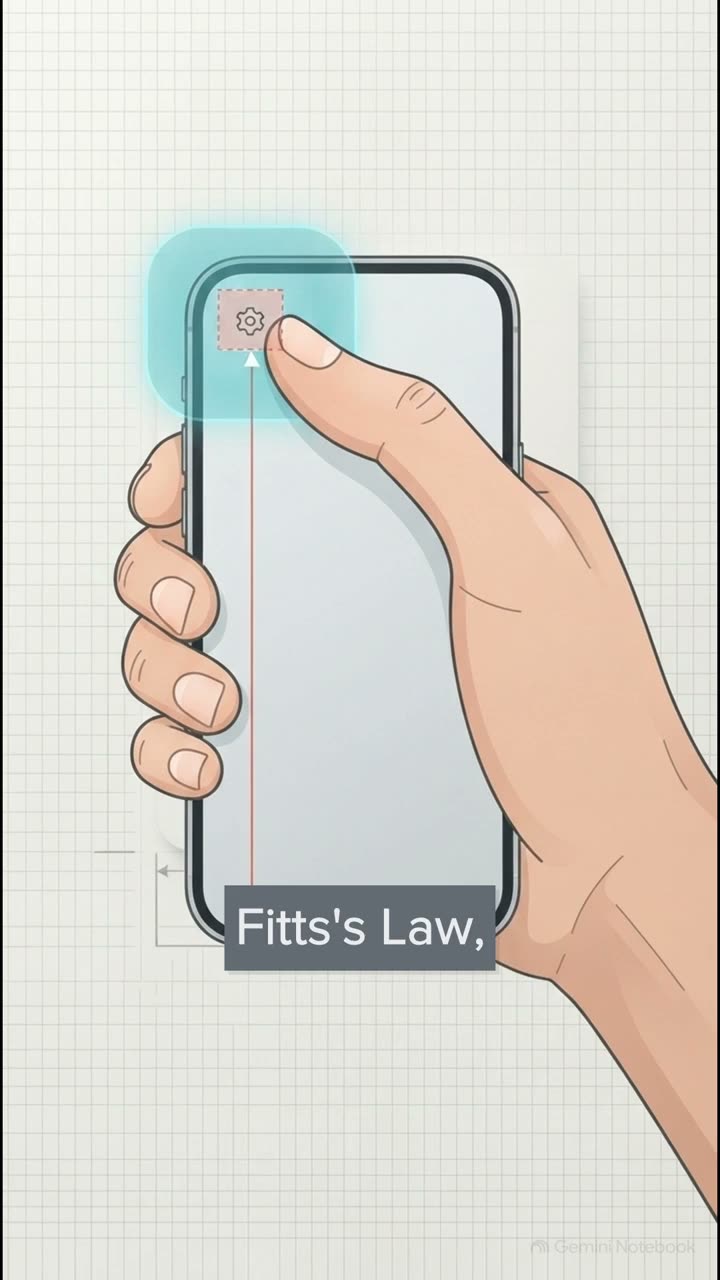
The maths of motor control. To engineer truly slip resistant interfaces, we have to respect the underlying mathematics of how we actually move. Now, Fitz's Law isn't just some loose design heuristic you can ignore.
Originating with Paul Fitz back in 1954 and adapted by Scott McKenzie in 1992, it's a quantitative, predictive motor model. It states that movement time relies on the Shannon index of difficulty. Basically, that index equals log base two of distance over width plus one.
To put that into plain English, mathematically, if you make a button tiny and put it miles away, you guarantee it'll take longer to hit and cause a lot more errors. But what if the user has to move through a constrained path? You know, like navigating one of those awful cascading drop-down menus.
Well, that is where the Accott Jai steering law from 1997 comes in. Unlike Fitz's law, which scales logarithmically, steering a cursor through a narrow two-dimensional tunnel imposes a brutal linear time penalty. The narrower the tunnel, the more agonizingly slow and error prone the movement becomes.
Busting four rampant UX myth. Now that we've got the math sorted, we need to aggressively dismantle some widespread design myths that are actively harming our users. First up, the myth of infinite edges.
What's really fascinating here is how Bruce Tognazini's famous infinite edge rule plays out completely differently depending on the device. On a desktop, pinning a menu bar to the screen edge creates an infinite target width.
The mouse literally physically stops at the boundary. It works beautifully on Mac OS. But on mobile, absolute catastrophe. Screen edges on touchscrees are hazard prone dead zones, constantly hijacked by iOS and Android back swipes, home indicators, or even just the physical lip of your phone case.
To back that up, Stephen Huber ran a massive empirical field study of over 1,300 mobile users, an N of 1,333, to be precise. He found that a whopping 49% rely entirely on one-handed thumb use. This means the bottom center arc of the screen isn't just a nice-to-have feature, it is the absolute most ergonomic target zone.
Pushing vital controls to the far-top edges just forces uncomfortable stretching and inevitable touch errors. The modality boundary. We've got to remember that Fitz's law only governs continuous spatial pointing.
If you're designing for keyboard users navigating with Tab under WACAG 2.1.1, or folks using hardware switch scanners or voice control under WACAG 2.5.3, well, pixel distance means absolutely nothing. For them, interaction costs scales strictly based on focus stop counts.
An interface might look brilliantly compact on screen, but if it requires 30 tab presses to get through, it's exhaustingly inefficient. Invisible hitbox padding. Developers love this one.
They'll take a tiny 14-pixel icon and just expand its invisible clickable area using CSS pseudo-elements to pass WCAG 2.5.8AA checks on paper. But here's the catch. A microscopic visual glyph still forces the user to hit the brakes during that closed loop visual homing phase we discussed earlier.
Plus, tightly packed targets near destructive actions are still going to trigger catastrophic slips, regardless of how much invisible padding you've added. Finally, myth 4. Confirmation habituation.
Research from Azeraskin and the Nielsen Norman group shows that throwing up knee-jerk are you sure pop-up models just trains a user's muscle memory to blindly click OK. It's practically a reflex. Instead, offering a non-blocking 10-second undo safety net is vastly superior.
Combine that with safe pointer up event cancellation per WCAG 2.5.2 and single-pointer alternatives to dragging or pinching under WCAG 2.5.1 and 2.5.7, and you've got a brilliant system for slip recovery. Which brings us nicely to section 4, the multimodal repair journey.
Let's take everything we've just covered and apply it to a real-world teardown. We are going to repair a broken video lesson platform called Pathway across multiple modalities. Now, if you're a vibe coder, relying heavily on unguided AI UI generators, you're almost certainly going to fall into these traps.
These LLMs love to default to desktop-centric hovers, microscopic 16 to 18 pixel Lucede or Hero Icon Ghost toolbars with a pathetic two-pixel gap, and those dreaded on mouse down triggers. Actually, that last one is a massive violation of WCAG 2.5.2 pointer cancellation.
Why? Because it activates the instant the mouse clicks down, totally robbing users of their ability to abort an accidental click by simply sliding their pointer off the target before releasing.
So, how do we fix the desktop pointer and mobile thumb experiences side by side? We take direct action. We bin those diagonal steering law submenus and replace them with safe click-triggered popovers using Ben Kamin's Amazon-style triangular cursor safe code.
We also expand those razor-thin three-pixel video scrubbers to a robust 44 pixels. And on mobile, we completely relocate primary controls out of those OS edge swipe dead zones and move them straight into Hoover's bottom center thumb zone, guaranteeing 48 dp of physical spacing between actions.
But we absolutely cannot forget our keyboard, switch, and screen reader users. We need to add explicit move up and move down buttons, plus 10 second skip buttons so keyboard and switch learners never have to fight their way through a scrubber tunnel.
We also reflowed the packed 18-pixel toolbar so it cleanly supports 400% zoom, which is 320 CSS pixels, without any hitboxes overlapping. And crucially, we strictly switch to on mouse up activation to ensure safe pointer cancellation for everyone.
And for everyday actions like deleting a note, we got rid of those jarring JavaScript confirm windows. We replaced them with a brilliant non-blocking 10-second undo toast, cleanly announced via the status role.
Now, just to clarify, truly irreversible consequences, like permanently wiping a learner's certification or a billing workspace, still warrant explicit friction, like typing a course slug. But for trivial actions, a simple 10-second undo allows neurodivergent and motor impaired learners to recover effortlessly without any panic.
Alright, section 5. Your hitbox diagnostic audit. Now is your turn to get your hands dirty. Let's walk through a practical diagnostic exercise you can run on your own interfaces today.
I want you to open up Chrome DevTools for about 10 minutes and just run through these four steps. First, toggle your CSS box model overlays to measure the actual visual versus interactive width of your targets.
Second, compute McKenzie's ID bits for your key actions, both before and after widening them. Third, test your UI to ensure users can actually sort items drag-free. And finally, verify slide-off pointer up cancellation.
Ask yourself, can a user click down, realize they've made a mistake, slide the cursor away and release safely. I highly recommend you take a screenshot of this slide right now. It's a quantified multi-standard reference sheet, designed so your team can stop guessing and start building interfaces mathematically sized for real human hands.
You've got your WAC 2.5.8AA minimums sitting at 24 CSS pixels, the 2.5.5 AAA enhanced standard at 44 pixels, Apple and Material Design recommendations at 48 dP, and the MIT Touch Lab's physical fingerpad measurement of 10 to 14mm. So I want to leave you with this final, somewhat provocative thought.
Are your interfaces built on naive aesthetics that actively cause motor slips? Or are they engineered for fast, safe human execution? As we gear up for our next explainer, where we'll be tackling how people perceive, grouping, simplicity, and distinction, keep in mind that real design isn't just about how things look.
It's fundamentally about engineering the physical reality of how humans act. Thanks so much for exploring this with me today, and I'll catch you in the next one.