Memory, Cues and Unfinished Tasks
Transcript
Made automatically from the video's sound, so it may contain mistakes. Click a line to play from there.
Welcome back. Right, having aligned Gestalt perceptual grouping, focal restraint and semantic DOM structure back in S11E3, so our interfaces pass effortlessly at a glance, we are officially entering arc two of this explainer.
And this is where things get really interesting. We're going to examine how users understand conventions, how they hold state in their incredibly fragile working memory, and how they actually resume unfinished tasks across sessions.
Our main goal today? Learning how to design external memory prosthetics. So here is our roadmap for today. We'll be hitting models, effects, and heuristics, the working memory myth, Zygarnik versus Ovziankina, fixing the multimodal journey, the AI UI trap, and finally wrapping up with a five-second UX audit.
Let's dive straight in. Section one. That is a cognitive model of the brain. The Ovziankina task resumption urge, well that's an empirical behavioural effect we can actually measure.
And Jakob's law is a design heuristic grounded in associative transfer. If we mix these up, we end up applying rules where they just don't belong. Let's take a look at mental models. Because of the power law of learning and Jakob's Law, which basically states users spend the vast majority of their time on other sites, any gratuitous navigation reinvention on your part causes severe mental model discordance.
I mean, you are literally fighting associative inertia. This is exactly why skewer morphism was originally used to transition early users to digital interfaces, mimicking real-world physical folders and rubbish bins. We have to leverage what users already know, not fight against it.
Section two: the working memory myth, Miller vs. Cowen. Alright, prepare to unlearn a massive staple of UX folklore. For decades now, confused designers have misused George Miller's 1956 magical number 7 as a rigid rule.
They'd say, oh, we have to cap visible navigation menus at exactly seven links. But listen, Miller was measuring one-dimensional absolute perceptual channel judgment and rehearsed verbal span. It was never a UI constraint.
Nielsen Cowan's later synthesis completely dismantled this, proving that pure, unchunked working memory capacity is something else entirely. The actual reality, pure working memory holds only four items. Yep, four, plus or minus one.
And honestly, it gets worse. Without active rehearsal, those items decay within a mere 15 to 30 seconds. Just think about that for a second. Your users literally cannot hold complex multi-step states in their heads while navigating your application.
The memory just vanishes. So, this strict biological limitation is exactly why we must rely on visual content chunking, like grouped phone numbers or scannable subheadings. It also heavily favors recognition over recall.
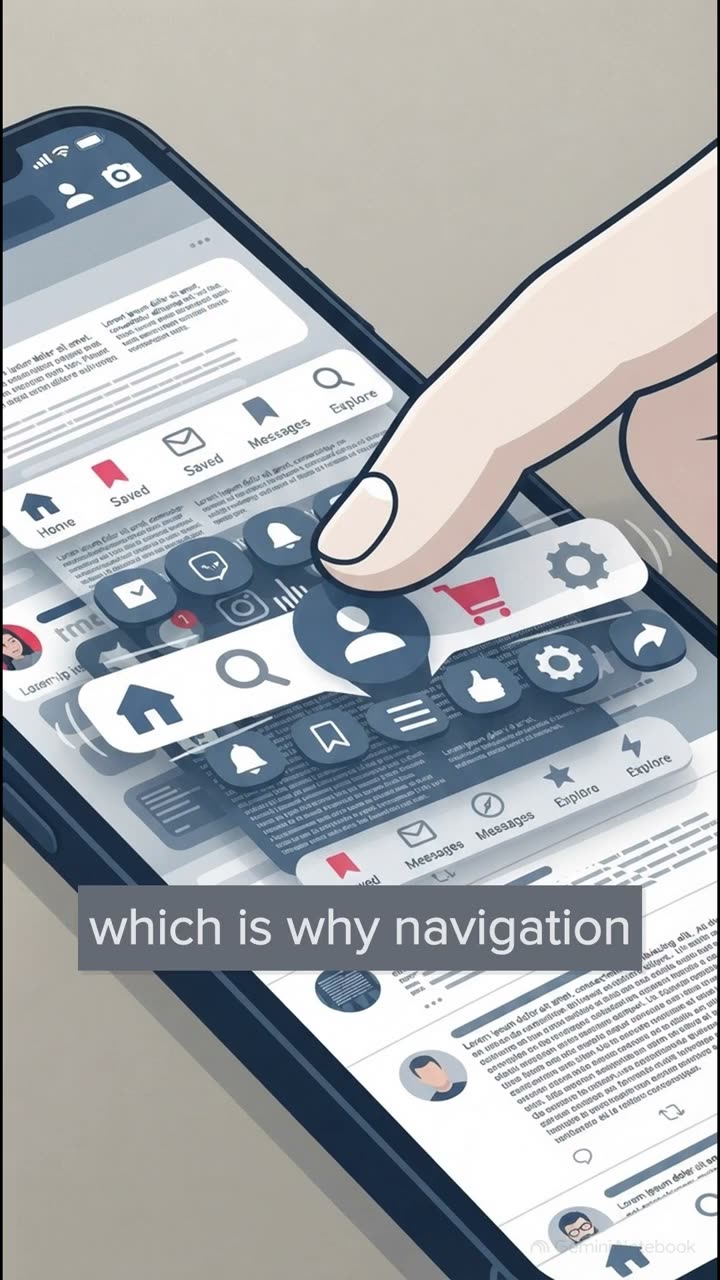
This means we absolutely must use visible text labels on icons, rather than burying them inside discoverability killing desktop hamburger menus. If you hide links, you're forcing users to rely on pure recall from a memory bank that wipes itself clean every 30 seconds.
Not a great strategy. Section 3. Zygarnik vs. Of Siankina.
Memory advantage versus task resumption. If you've ever just assumed users will magically remember where they left off in your app, you really need to hear this. A 2025 Nature meta-analysis proved that Blumer Zygarnik's famous 1927 theory, the idea that we have an unassisted recall advantage for unfinished tasks, well, it fails to replicate reliably.
It hits a ratio of about 0.99, which is essentially a coin toss. However, Maria Ofsiankinus theory, the behavioral urge to actually resume an interrupted task, is a highly successful, measurable phenomenon. In fact, roughly 67% of users will voluntarily return to finish an interrupted task.
But, and this is a massive catch, this Ovsiankina resumption only succeeds if your UI provides a visible external state. Think of a gov.uk style task list, showing completed or in progress. Users want to finish the task, but you have to show them exactly where they were.
And please, do it without weaponizing anxiety-inducing red dot notification badges. Section 4. Fixing the multimodal journey, the pathway learning platform case study. Let's transform these abstract models into concrete interface repairs.
Imagine walking a returning learner and a team onboarding coordinator through the pathway portal. First, we fix the desktop pointer by replacing an avant-garde, unlabeled icon-only left rail with convention-aligned labelled navigation.
Then, for the mobile thumb, and remember touchscreoltips to save you, we anchor core destinations in the primacy and recency slots of a labelled bottom tab bar. This perfectly exploits Ebbinghouse's serial position effect. And to fix things for keyboard and switch users, we strictly adhere to WCAC standards for consistent navigation and consistent help.
This stops jumping header orders or wandering support widgets that completely destroy a user's spatial memory. Remember, tab muscle memory relies entirely on things staying exactly where the user left them.
Now, at 400% zoom, we preserve compact context banners in line. This means magnified users never have to pan backwards just to recall prior steps. For screen readers, we contrast silent mystery buttons and step resets with explicit accessible names and structural area attributes, like setting ARIA current to step.
We pair those with explicit structured status announcements. And for cognitive and neurodivergent access, we comply with W3C Koga guidelines for redundant entry. We automatically populate organization details across onboarding steps so users never have to remember and retype them.
And finally, we ensure accessible authentication by completely removing cognitive puzzle gates. We allow password manager autofill, ending the absolutely absurd security theatre of blocking users from pasting their own passwords.
Seriously, let people paste. Section 5, the AI UI trap, when vibe coders ignore cognitive limits. Okay, this exposes exactly why unguided AI UI generators routinely spit out interfaces that look sleek but are functionally disastrous.
When vibe coders prompt strictly for aesthetics, human cognitive limits are just ignored. Without explicit constraint prompting, AI generates these six-slide modal carousels that evaporate from a user's working memory before they even reach step one.
It relies on discoverability killing hamburger menus, and it builds volatile, client-only React state that wipes a user's entire multi-step draft the second they accidentally hit tab refresh. It is a nightmare.
Section 6: the 5-second UX audit, a hands-on diagnostic exercise. Let's wrap this explainer up with a quick 15-minute diagnostic exercise you can run today to see if your app actually respects human memory. First, hide your tooltips and verify your icon labels don't require pure recall guessing.
Next, refresh a mid flow browser tab and verify it results in zero loss of Siankina draft resumption. Then test that you can actually paste a password from a manager. And finally, verify that your help links are perfectly consistent across at least three different routes.
These limits dictate exactly why we must design external memory prosthetics, rather than forcing users to hold complex state in their own heads. So hold these cognitive limits in mind as you audit your products. Look at your interface right now.
Are you actually designing memory prosthetics, or are you just crossing your fingers and hoping your users remember? Think about it. Thanks for joining me for this explainer, and make sure you tune in next time for S11E05, where we'll be diving into time perception, INP latency thresholds, skeletons, and optimistic UI mechanics.
See you then.