Applying UX Principles
Transcript
Made automatically from the video's sound, so it may contain mistakes. Click a line to play from there.
Hello and welcome to this capstone explainer. We have finally made it to the thrilling conclusion of season 11. This is where we bridge that massive gap between abstract theory and the messy, high-stakes reality of production.
Now, if you build interfaces, you already know, right? Design isn't just about making things look pretty. It is all about making really hard choices. So today we're going to synthesize everything we've learned across the season and build a completely unified, evidence-based playbook for your next system build.
Having successfully grounded multi-step motivation in honest goal gradient progress and peak end recovery endings, our capstone now has to confront the real world. And out in the wild, perfectly valid UX principles violently collide. Engineering teams actually have to sit down and decide who carries the burden of irreducible complexity and how exactly a system manages to be incredibly forgiving for humans whilst remaining rigidly protocol strict on the back end.
Okay, let's dive into this agenda. We'll cover principles in collision, the Postel Protocol myth, repairing the checkout pathway, multimodal accessibility, resolving trade-offs empirically, and finally our season 11 Capstone playbook.
Principles in Collision. Now, you really can't talk about system architecture without immediately confronting Tesla's law. You might know this as the law of conservation of complexity or even the waterbed effect.
The core idea here is absolutely crucial. Every single application or domain has an inherent amount of irreducible complexity. Think about it. Once you've completely shaved away all that accidental bloat using Occam's razor, you're left with this dense, stubborn core of complexity that literally cannot be removed.
It can only be shifted around. So the big question is who takes the hit? Does the engineer absorb it in code, or do we lazily push it onto the user? Well, Larry Tesla put it perfectly.
He argued that if a million users each waste a minute a day dealing with complexity that an engineer could have eliminated in just a week of hard work, you are penalising the user. And honestly, this right here is the fundamental difference between honest engineering and those folk UX cargo cults.
We absolutely must spend that extra week writing the code to absorb all that formatting and lookup drudgery, just so our millions of users don't have to pay that daily tax. The Postel protocol myth.
Time to bust some high stakes engineering myths. First up, let's talk about John Postell's famous robustness principle. You know the one. Be conservative in what you send and liberal in what you accept.
Now, for years, engineers applied this absolutely everywhere. But here's the critical distinction we need to make. Postel's law belongs strictly at the human UI input boundary. If a user types a UPA phone number and throws in spaces, brackets, or a plus sign, the UI should be liberal.
Strip those out and accept it. But on the back end, no way. According to the IETF's RFC 9413 guidelines, silently guessing malformed or ambiguous inputs on the back end causes silent data rot, ossification, and massive security bugs.
The back end actually requires what's called virtuous intolerance. So we need forgiving UI normalization layered over a strictly structured, unbending backend schema. The blatant misuse of progressive disclosure.
Look, proper progressive disclosure is a fantastic architectural heuristic where we scope the 80% core flow cleanly and just hide the 20% optional advanced controls behind a menu or accordion. That is great UX.
But hiding mandatory VAT, seat minimums, or auto-renewal terms inside an accordion, that is not progressive disclosure. That is a highly deceptive dark pattern known as sneaking. Sneaking completely destroys user trust, and let's be real, in many jurisdictions it's entirely illegal.
Repairing the checkout pathway. Let's fix some broken interfaces. Alright, so here we have two pretty classic vibe coder failure extremes. On the left, we've got extreme A, just a terrifying 18-field enterprise form dump.
It asks for raw SAML XML code right up front. The number fields literally mutate if you accidentally scroll your mouse wheel, and it hits you with this live flashing red error spam the second you type your very first keystroke.
And to top the whole shebang off, it features an irreversible one-click billing button for thousands of pounds. Yikes. Then on the right, extreme B, a classic sneaking drip fee checkout that hides mandatory costs across four separate hidden drawers.
Both of these extremes completely ignore empirical UX science. So to repair this pathway, we look to Smashing Magazine's inline validation strategy, which is simply reward early, punish late. Think about it.
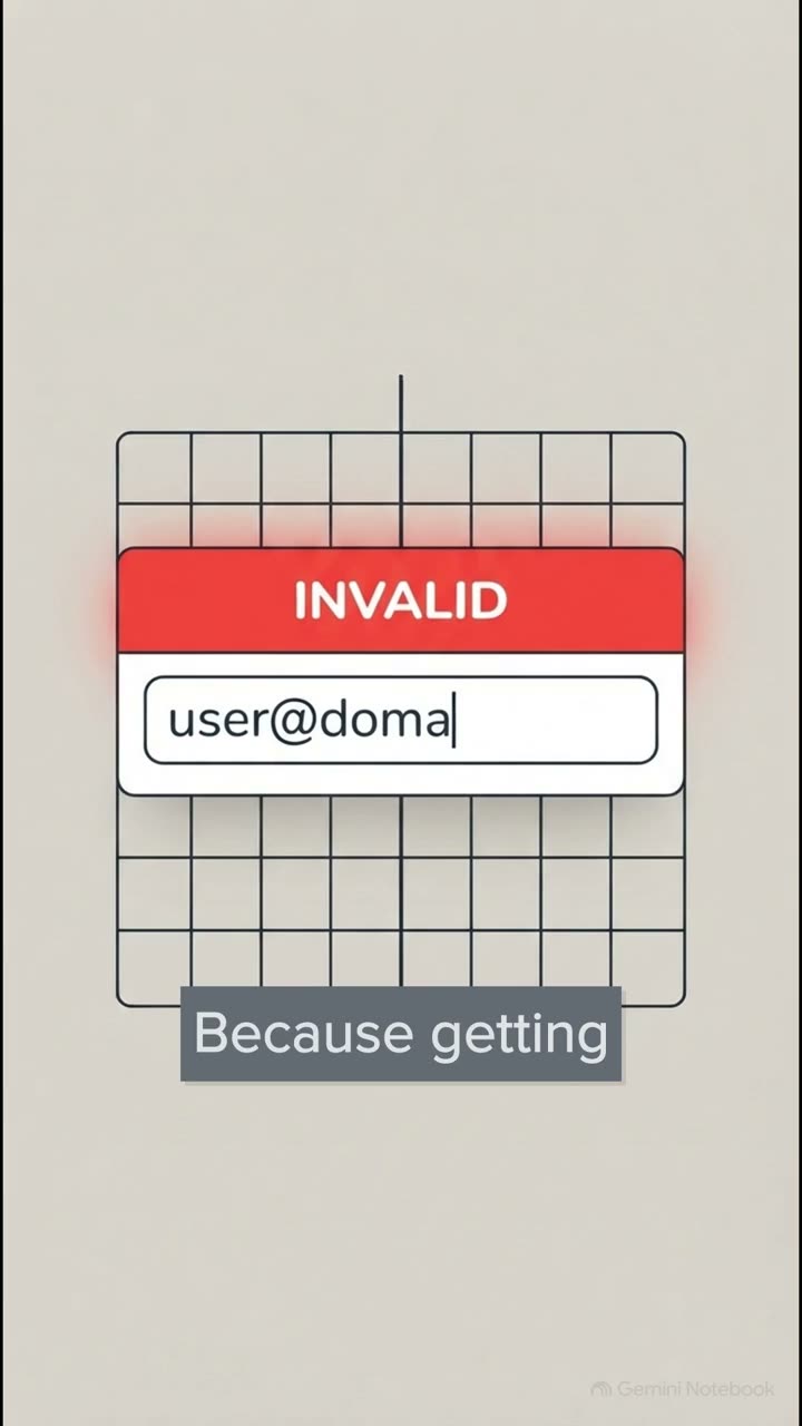
If you validate immediately, while a user is halfway through typing a long email or a policy number, you're interrupting their cognitive flow with premature errors. It's so frustrating. Instead, we need to validate late.
Wait until they actually leave the field or on blur. However, if they are actively fixing an existing error, we validate immediately, on change. So we reward them early by removing the error the exact second the input becomes valid, but we punish late to avoid yelling at them on keystroke number one.
Multimodal accessibility in practice. You know, designing for a mouse pointer is pretty easy. But what about our keyboard, switch, or mobile thumb users? Following the brilliant gov.uk design system rules, when a form fails on submit, we don't just leave users hanging.
We generate an error summary at the top of the page, and programmatically pull the keyboard focus right to it, using a negative tab index. We then provide anchor links that jump straight down to each specific field. This ensures we eliminate those awful scroll wheel mutations, make sure our touch targets are large enough, and guarantee the interface reflows perfectly vertically for users relying on 400% zoom, with zero horizontal scrolling.
Now for screen reader and cognitive accessibility, we turn to the hard WCAG 3.3 standards. First up, we absolutely must silence that premature ARIA live chatter, you know, where the screen reader rudely interrupts to shout, invalid email, after a single type letter.
It's chaotic. Then, when an error actually does occur on submit, WCAG 3.3.3 demands we provide a concrete example of how to fix it, rather than just vaguely saying invalid format. And finally, to satisfy WCAG 3.3.4 for any legal or financial data, we have to provide a calm, explicit check answers review table.
We need to disambiguate things like dates explicitly, for example, showing 3rd April 2026, so users know exactly what they're committing to before they ever hit that final billing button. Resolving trade-offs empirically.
Now what's really interesting about this slide is how it maps the way perfectly valid principles inevitably clash in a real production environment. Hicks law tells us to reduce top-level options to speed up decision making, right? But then Fitz's law and the principle of recognition over recall argue for one-click speed and visible scannability.
That means showing more options up front so users don't have to go pogo sticking through deep hidden menus. Similarly, Jakob's law demands familiar, conventional interfaces, whilst power users are over there demanding complex, layered keyboard accelerators.
You simply can't satisfy both extremes perfectly. So, how do we actually settle the debate when these principles collide? Well, not by arguing in a meeting room for hours for sure. We do it through an empirical workflow.
Step one is running a Nielsen Norman group heuristic evaluation. This is going to catch those glaring obvious rule breaks fast and on the cheap. But for those deep fundamental trade-offs, like Hicks versus Fitz law, step two is absolutely required.
A five-participant task-based usability test. You must empirically adjudicate these collisions using real users trying to accomplish real tasks on your actual system. Season 11 Capstone Playbook.
Let's bring it all together. So the crucial point is this. We absolutely must separate empirical human factor science from folk UX cargo cults. Every single interface decision you make moving forward should be firmly grounded in perceptual psychology, motor biomechanics, and cognitive limits.
Across this season, we've learned how to build systems that are wonderfully human forgiving at the UI layer, happily accepting messy inputs and validating them gently, whilst remaining rigidly protocol strict on the back end, using hard RFC 9413 schemas and explicit WCAG standards.
And that leaves us with one final provocative question as you head back to your teams to start your next build. The complexity in your system isn't going anywhere. It has to live somewhere.
So will you choose to absorb that irreducible complexity through honest, rigorous engineering? Or will you force millions of users to pay the daily tax of your shortcuts? The choice is yours.
Thank you so much for joining me for this Capstone Explainer, and I'll see you in the next one.