Building a Colour Scheme
Transcript
Made automatically from the video's sound, so it may contain mistakes. Click a line to play from there.
Now that we know exactly how OKLCH lightness, tinted neutrals, and contrast work on single pairs, we're going to assemble a complete multi-theme semantic colour system. Welcome back to the explainer. If you've been following along, you know we've already laid the groundwork.
So today is all about the architecture. We're taking that theory and building a robust, scalable colour scheme that absolutely will not break the second you toggle over to dark mode. Think of this agenda as your ultimate system architecture blueprint.
It's literally going to take you from a blank canvas to a production-ready multi-theme UI. We'll be covering escaping broken colour systems, building 50 to 950 perceptual ramps, semantic roles and the 6030-10 rule, wiring light and dark modes, the laws of dark mode, and finally visual archetypes and next steps.
Let's get into it. Section one, escaping broken colour systems. Moving beyond generic generation. Okay, let's dive into this by looking at what we are explicitly trying to avoid.
We've all seen this first example across a million SAS landing pages. It's what I like to call purple AI slop, mixed with a completely broken hex inverted dark mode. Just look at the dark version.
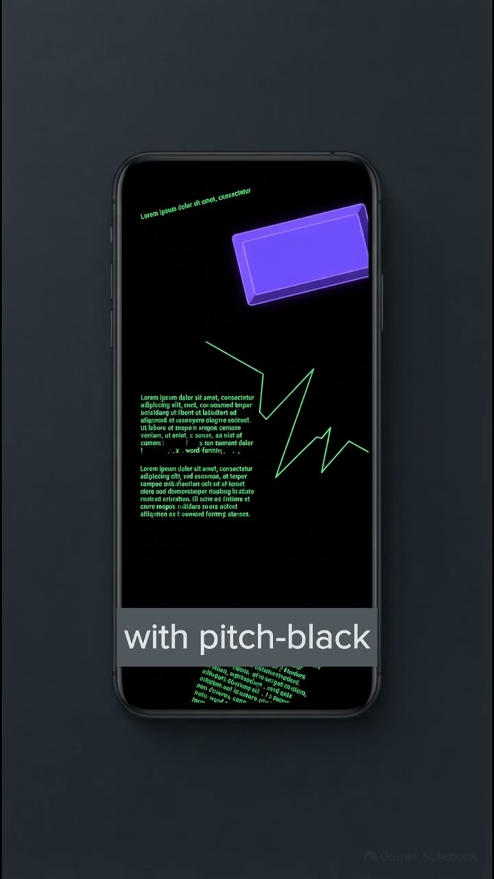
That pure black background causes the white text to halay. It literally vibrates on the screen and strains your eyes. And because the background is pitch black, those drop shadows on the cards completely vanished.
It totally destroys the visual hierarchy. Contrast that with the pristine semantic token system we're showing here. The HTML is absolutely identical, but it's styled cleanly across both themes. It feels calm, it feels intentional, and it's perfectly legible.
Now, we already know why legacy formats like HSL fail to deliver this consistency, so we aren't going to rehash those basics today. Instead, we're going to learn how to build that flawless system. Section 2, building 50 to 950 perceptual ramps, the foundation of modern palettes.
To get that pristine look, we really need a solid foundation. And honestly, that means relying on trained perceptual scales to give us the guardrails we need to prevent accessibility failures. The secret source here is scaling your OKLCH lightness into an 11-step perceptual scale.
By matching OKLCH lightness to this exact 11-step ramp, which runs from a near white 50 all the way down to a near black 950, we can guarantee uniform contrast across the entire user interface. And the best part, you don't need to invent any complex DIY maths formulas.
By locking in the lightness at each specific step, you can slide the hue around however you want, and your perceptual contrast remains totally stable. It's a real game changer. Now what's really interesting about this slide is how this framework removes literally all the guesswork from your design process.
Every single step on this 11-point ramp has a quantified tool-agnostic structural purpose. So you'll use steps 50 to 100 for your background surfaces. Step 200, that's reserved for subtle hover and active tints.
Steps 300 and 400 give you the perfect contrast for borders and focus rings. Then 500 and 600 are your solid fills and vibrant interactive accents. And finally, steps 800 through 950 provide the deep high contrast values you need for legible text and icons.
This setup aligns beautifully with accessibility standards, meaning you always have exactly the right tool for the job. Section 3, semantic roles and 603010, giving your colours a purpose. Right, so having a perfectly balanced scale is brilliant, but it isn't quite enough on its own.
We actually have to translate those raw colour values into structural meaning, so developers can use them without losing their minds. And this is exactly where semantic tokens come in. A semantic token communicates the structural purpose of a colour, think BG Surface 1, rather than its raw visual value, like slate 900.
Decoupling your markup from specific colour names is the absolute secret to making your themes instantly swappable. Think about it. If your code says text slate900, you're going to be forced to write really clunky overrides when you switch to dark mode.
But if your code says text primary, it just works, no matter what theme is active. It's the 603010 rule. This gives us hard, fast numbers for balancing a layout. So 60% of your interface should be a calm neutral canvas, usually pulling from those 50 to 100 step background tokens.
30% is dedicated to structural surfaces and ink, so things like cards, borders and text, and then a maximum of 10% is reserved for your interactive accents. Applying this restraint is exactly what separates a professional premium design from a chaotic overwhelming mess.
Section 4 wiring light and dark modes the live canopy transformation. Let's actually see this theory in action shall we? We're now going to apply everything we've just covered directly to our sample UI property, the canopy interface.
Let's move to and see how this builds our interface layer by layer. First up we anchor our canopy UI in a non-purple botanical forest primary ramp and we pair that with a temperature matched warm limestone neutral ramp. Next we bring in our standard success warning and danger status scales for things like form validation.
And finally we wire up all six sections of the UI the navbar, the hero canvas, the elevated feature cards, a tinted editorial pool quote, a highlighted pricing tier, and of course our sign up focus and error state. We map all of this using variable modes in Figma or variables in Webflow and Framer.
And because we used semantic tokens, the entire structure is completely locked in. Now, on the development side, things have gotten infinitely better. We used to rely on complex static media queries targeting Prefers colour scheme, which basically forced you to write your CSS twice.
It was a nightmare. But with modern baseline CSS capabilities, we can just set colour scheme light dark at the root and use the dynamic light dark function. This lets us dictate exactly how our semantic roles behave dynamically without any of those clunky overrides.
The browser literally handles the heavy lifting for us, serving up the correct OKLCH value from our ramp based entirely on the user's system preferences. Section 5. The laws of dark mode.
Stop breaking your shadows. Remember that absolutely terrible inverted dark mode we saw at the very beginning of the explainer? The one with the vibrating text and the vanishing shadows.
Well, we're about to learn the definitive rules to fix that forever. You absolutely need to memorize these four tool agnostic laws. Law 1, never ever use pure black. Instead, use a tinted charcoal canvas sitting at 12 to 16% lightness.
This completely stops that awful text hilation effect. Law 2, lighter equals closer. Because drop shadows disappear on dark backgrounds, you must elevate your surfaces by adding roughly 3% lightness to them, so they actually pop off the canvas.
Law 3, accent desaturation. You have to drop the chroma of your vibrant accents by 15 to 25% in dark mode. Otherwise they're going to vibrate painfully against the dark background and cause Syria and eye strain.
And finally, law 4, hairline borders. Use an 8 to 12% white alpha for borders. This gives you crisp separation without overwhelming the layout. Follow these four laws, and I promise you your dark mode will always look incredibly premium.
Section 6. Visual archetypes and next steps. Proving the system's power. Okay, the heavy lifting is officially done.
We've built the ramps, mapped the tokens, and mastered the laws of dark mode. Now it's time for the payoff. Let's see just how incredibly powerful a robust architectural system truly is. Because our UI relies entirely on semantic tokens, we can utterly transform the vibe of the canopy app by swapping out just a handful of values.
Seriously, it's like magic. If we swap to a warm editorial archetype, our backgrounds become parchment and our accents terracotta, shifting incredibly smoothly into a warm peat dark mode. Swap again to crisp Swiss and we get cool paper and cobalt signal, dropping into a precision slate dark mode.
Or we can go for a tactile craft brand, using espresso and ochre that shifts into this gorgeous warm walnut dark mode. This proves exactly why a three-variable OKLCH architecture, controlling hue, chroma and contrast, absolutely obliterates those generic five swatch colour generators.
The layout didn't change at all, the markup didn't change, but the entire emotional resonance of the application was completely transformed. So, the crucial point is that you need to put this into practice immediately. Your mission is the 15 minute exercise.
I want you to jump into your Figma or CSS workflow right now, pick just 10 semantic tokens, apply that 603010 restraint, and build a cohesive light and dark theme wireframe today using the rules we just covered. Once you do that, you'll have absolutely mastered perfect colours.
But that brings us to a massive looming problem. What happens to an interface when the typography makes those perfect colours completely illegible? I mean, it doesn't matter how flawless your perceptual okay LCH ramps are if your font weights totally destroy the contrast, right?
And that is exactly what we're going to tackle in our next session on typography. Thanks so much for joining me on this explainer, and I'll see you in the next one.