Spacing & Visual Rhythm
Transcript
Made automatically from the video's sound, so it may contain mistakes. Click a line to play from there.
Welcome back to The Explainer. Today we're diving straight in to master the invisible spatial architecture that effortlessly groups every heading, card and form field on a page. We are conquering spacing and visual rhythm.
To kick things off, a quick recap of our last explainer. With our canopy fluid typescale sorted, our 65 character measure in place, and our leading firmly locked in, we are officially closing out our second arc by mastering the invisible four-pixel and eight pixel spatial architecture that effortlessly groups every heading, card, and form field on a page.
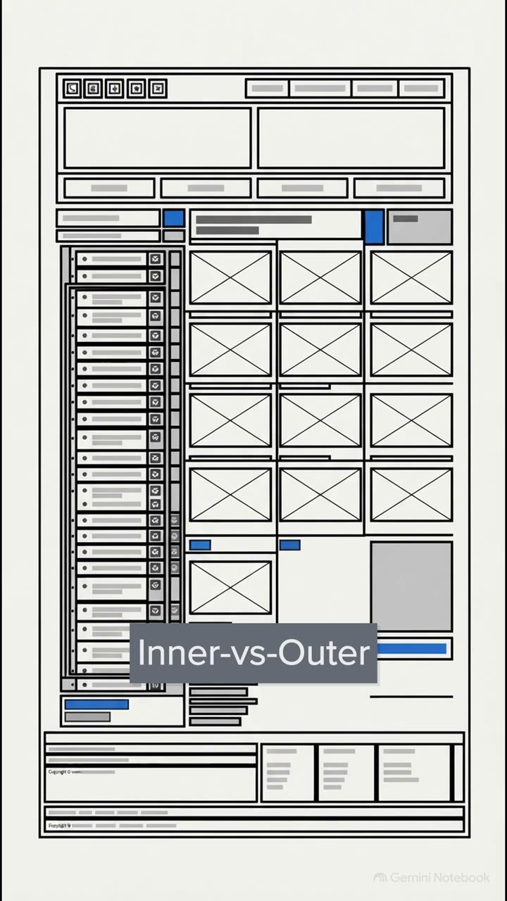
We have our raw materials ready to go. Today is entirely about the space between them. Just have a look at this. On the left, we've got what I like to call box soup, an amateur, maybe even AI built layout that feels incredibly claustrophobic.
It's heavily relying on arbitrary magic numbers, you know, a random 13 pixels here, 27 pixels there, 41 pixels somewhere else, with headings floating equidistantly between paragraphs, all trapped inside heavy borders and aimless 160 pixel template padding.
But then look at the right. That is deliberate rhythmic spatial cadence. The elements don't need heavy generic borders because the space itself is doing the structural heavy lifting.
Escaping the box soup. The brilliant designer Mark Bolton hits the nail on the head here. He makes a crucial distinction between two types of space. You've got passive white space, which is basically the unconsidered space or standard macro margins that just give a layout some balance and breathing room.
But active white space, now that's the good stuff. That's what we intentionally use to guide the reader's eye, structure the information, and literally take them on a journey through the design. And this active structuring is heavily anchored in Eric Kennedy's law of locality, pulling straight from the gestalt principles of proximity.
Put simply, elements that are close together are perceived to share functionality and traits. If a heading sits closer to the paragraph below it than the section above it, our brains instantly group them as a single semantic unit.
But if the spacing's just floating equidistantly everywhere, well, your brain has to work way harder to decode what belongs where. The four-pixel spatial ladder. So instead of just guessing and using those magic numbers, we strictly rely on a 10-step spatial ladder.
Drawn from top-tier design systems like Atlassian and IBM Carbon, this scale is built on a solid 4-pixel and 8-pixel base unit. It gives us brilliant predictable harmonic intervals, 4, 8, 12, 16, jumping all the way up to 128 pixels for those massive macro spaces.
And by tying these steps to Figma Auto layout tokens, web flow or frame of variables, or Utopia's fluid space pairs, these gaps scale beautifully and proportionately across every screen size. The logic of locality.
Let's actually quantify this space. This right here is absolute hard-coded spatial logic. These three golden proximity ratios will practically eliminate guesswork from your layouts.
Number one, a container's outer padding must be 1.5 to 2 times larger than its inner gap between child elements. Number two, a heading's top margin must be at least two and a half times its bottom margin.
Think margin block 2em 0.6EM. And number three, the space between distinct form fields must be at least three times larger than the micro gap between a label and its input. So you're placing sign-up labels, maybe four to six pixels above inputs, but keeping 16 to 20 pixels between the fields themselves.
Parent-owned gaps and flow. Let's look at the tool agnostic application. We absolutely have to banish leaky margin collapses. As CSS expert Josh Camot points out, applying top and bottom margins directly to text creates totally unpredictable collapsing.
Modern web design favours parent-owned gaps. Using CSS grid or flexbox gap properties, or a clever utility class like Andy Bell's.flow stack ensures your rhythms remain robust, consistent, and completely resilient to WCHE text spacing overrides.
And we can even fix that historical quirk of web typography known as half leading. Traditionally, a text box includes invisible space above the cap height and below the baseline, which makes true optical vertical alignment a total headache. But by using the modern CSS text box trim property, or Figma's vertical trim feature, we can slice away that legacy half leading and perfectly center our text optically within things like buttons.
It is an absolute game changer. Archetypes and spatial density. Let's put this into practice with a live canopy transformation. By locking our colours and fonts, we can refactor just the spacing to create completely distinct visual archetypes without losing an ounce of clarity.
First up, the warm editorial brand. Notice how this layout relies on dramatic 96 to 128 pixel macro pauses between sections. It uses wide asymmetric breathing room to create an upscale, sophisticated elegance, very high-end magazine vibes.
Alternatively, if we shift gear to high precision micro density intervals, we get this highly functional, crisp Swiss or technical utility character. Here, we're relying heavily on the bottom end of our spatial ladder, just 4, 8, and 16 pixels.
This tight structural proximity suggests complex information being presented efficiently. It's exactly what you want for a dense software dashboard. Finally, if we expand those inner container gaps to generous 32 or 48 pixel plush tonal card insets, we instantly get a tactile craft brand.
This spacing feels incredibly cushioned, friendly, and approachable. And the brilliant part is all of this distinct brand character is achieved purely by shifting our position on the spatial ladder. The border deletion exercise.
Let's truly test this density. As we live refactor these sections, we snap all rogue margins onto our 10-step ladder, we anchor our editorial headings with that 2.5 to 1 rhythm. Then we ensure our card padding, say 32 pixels, is greater than or equal to the 24 pixel grid gutter, which in turn is strictly greater than the 12 pixel inner stack gap.
Because the space is now perfectly defining the relationships, look what happens. We can actually delete half of the generic template divider lines. The structure just holds up entirely on its own. So here's my challenge to you.
Can your layout survive without borders? I highly recommend trying this 15 minute border deletion exercise on your own projects to prove that active structural white space makes generic borders completely obsolete.
Take off the training wheels, ditch the boxes, and let the space do the talking. Good luck with your refactoring, and I'll catch you next time when we explore grids, alignment, and layout.