A Complete Website Redesign
Transcript
Made automatically from the video's sound, so it may contain mistakes. Click a line to play from there.
Welcome to the grand finale of our Visual Design Explainer series. With our 40 token semantics system and our design.md guardrails finally locked in from our last session, we are pulling everything together into a repeatable, highly structured workflow.
Today is all about delivering on one central promise: truly understanding why a website looks good and knowing exactly how to fix one that doesn't. We're bringing this entire 14-part journey right to the finish line. We are going to take the original, untouched and frankly pretty cluttered baseline canopy website, and we're going to completely rebuild it from scratch.
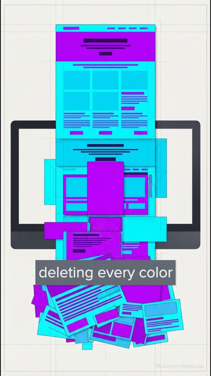
But we aren't just going to guess our way through it. We're going to execute this across six incredibly disciplined passes. Because this perfectly illustrates the exact problem we are trying to solve. On one side, you have your typical amateur AI reskin, slapping dark mode, neon purple gradients on things, tossing in floating 3D blobs, and wrapping absolutely everything in bento borders, just to mask a broken structure and a really weak visual hierarchy.
On the other side, we have the six-pass craft. This is a structurally sound, gorgeously engineered user interface grounded in the enduring web design principles of absolute legends like Frank Chimero, Oliver Reichenstein, and Eric D.
Kennedy. To achieve that level of craft, here is the exact six-pass blueprint we'll be using today. One, hierarchy triage, two, grayscale typography, three, spacing and grid, four, colour and depth, five, usability validation, and finally, six, accessibility and synthesis.
Let's dive right in. Hierarchy. Triage. This first structural pass is absolutely ruthless.
We subject our cluttered baseline site to a rapid 50 millisecond squint test. We're stripping away all those unnecessary boxitis borders, right down to the bare bones. Specifically to lock in exactly one focal anchor and one primary call-to-action per view.
To enforce this, we rely heavily on scale. The Nielsen Norman group has shown that using a strict three-size maximum, just small, medium, and large, directs the user's attention perfectly without overwhelming the eye.
Grayscale typography. Now, in this pass, we are enforcing a brutal black and white constraint. Let's be real. If it doesn't work in pure grayscale, it just doesn't work.
Typography is essentially 95% of web design. I absolutely love this quote from IA because it forces us to choose our two-font voice pairings so carefully. It's exactly the approach gov.uk took when they tested their highly legible new transport typeface in pure black and white first.
From there, we lock our typography into a strict mathematical system, kind of like IBM's carbon design fluid typescale. We completely eliminate arbitrary font sizes by using CSS fluid clamp functions, setting our 1.1 leading and adding some very subtle tracking adjustments.
By anchoring our main pros at a highly readable 18 pixels and maintaining an optimal 65 character maximum width, we ensure the user's eyes aren't fatigued tracking across massive ultra-wide monitors. Spacing and grid.
Once our text is dialed in, we constrain our elements into a predictable visual rhythm. This means strictly defining the tight inner proximity between related items versus the loose outer proximity that separates entirely different sections.
We lean heavily on the carbon design systems, brilliant eight pixel mini unit here. Whether we're building a subgrid pricing row or doing an asymmetric 7x5 column split, every single margin and padding is a multiple of eight. It creates this invisible consistency that the brain just unconsciously registers as organized.
But, as the design team at Atlassian is quick to remind us, the maths only gets you so far. Even the strictest 8-pixel grids require some optical adjustments. You see, our eyes are incredibly easily fooled by visual weight.
A hanging quote mark or a play button triangle can look totally misaligned even when they are mathematically dead center. So we literally have to nudge these elements slightly off the strict pixel grid to make them look optically perfect.
By strictly locking passes one through three entirely in grayscale, we have effectively engineered the absolute hardest part of the redesign. Over 70% of your total visual polish is achieved in raw structure before you ever even think about touching a single colour token.
Colour and depth. Only now do we finally unlock our beautiful OK LCH colour palette, layering in concentric depth and some highly subtle 180 millisecond motion. To keep our colour application completely disciplined, we map our tokens using a framework like the Radix usage scale.
We use those subtle steps, one and two exclusively for our app backgrounds, steps six through eight for our borders, and we reserve steps 11 and 12 strictly for high contrast text. That discipline completely prevents that muddy, low contrast AI reskin soup we looked at earlier.
Usability validation. With the visuals really taking shape, we apply the linear UI approach to refine our gaze directed photography, implement scrims, and lock in our 24 pixel icons. But crucially, you absolutely have to dog food this interface internally.
You must test realistic scenarios, like a single-column sign-up flow, with actual internal teams using feature flags long before a public rollout. You have to ensure that your beautiful new design doesn't accidentally break real user workflows.
And finally, pass six: accessibility and synthesis. For our final pass, we lock in all those semantic tokens and rigorously test our fluid container reflows, ensuring the entire site holds up flawlessly at a 320 pixel mobile width, or even at 400% zoom.
And this contrast ratio of 4.5 to 1, it is absolutely non-negotiable. Alongside jawband focus states for keyboard navigation, this guarantees our beautifully crafted interface meets strict WCAG 2.2 guidelines. It makes it genuinely usable for everyone.
Finally, we synthesize. There's this super common fear out there that following Jacob's law and relying on strict structural usability makes a website look generic, but it's completely false. By swapping our discipline tokens, we can render the exact same canopy architecture into wildly distinct styles.
We can do a warm editorial style with optical serifs and warm paper neutrals, or a crisp Swiss technical utility using tabular mono on a hairline grid, or even a tactile craft brand with warm tonal layers, studio photography and rich overhead shadows.
Strict structural discipline doesn't erase your brand identity. It amplifies it. Now that you possess the master six-pass scorecard and the complete guardrail sheets, it is time for action.
I want to challenge you to a 60-minute sprint on one of your own projects. Lock yourself in pure grayscale for the first three passes. Apply the maths, refine the optics, and only then unlock your colours. I promise you, once you experience this transformation firsthand, there is no way you will ever look at web design the same way again.
So, what are you going to rebuild today?