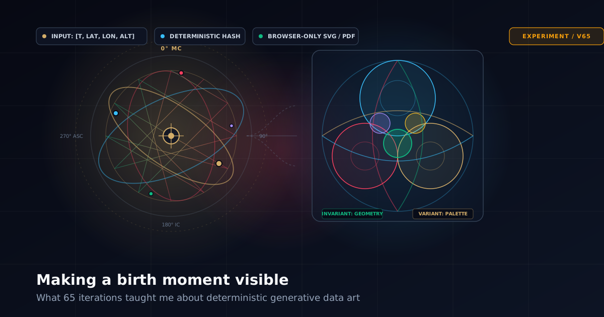
I started with what sounded like a small idea: take somebody's date, time and place of birth and turn it into a piece of art.
Not an AI-generated picture. Not a horoscope with decorative graphics around it. A deterministic visual system: give it the same birth moment twice and it should produce the exact same artwork twice.
That distinction turned out to matter.
It also turned what looked like a weekend experiment into more than sixty iterations covering astronomy, calendar systems, procedural graphics, colour theory, localisation, animation, PDF generation, deep links, multi-person composition and a surprisingly difficult question:
When does a visualisation actually feel personal?
The answer was not “when enough numbers from the birth date have been fed into it.” A chart can use twenty different variables and still look almost identical for everyone. That became the central problem.
What this article covers
- Why deterministic art was more interesting than AI-generated art for this experiment.
- The difference between changing details and changing the actual visual composition.
- How the project expanded from Western astronomical charts into several cultural calendar traditions.
- Why some attractive chart ideas were rejected despite being technically successful.
- What happened when we started combining two people's birth moments into one artwork.
- Why colour itself became a second form of personalisation.
- What animation, deep links, localisation and browser-only export added to what began as a static SVG experiment.
The original constraint: the same birth moment must produce the same art
The easiest version of this project would have been to create a prompt from someone's birth details and send it to an image model. That would certainly produce variation. It would also make the connection between the data and the result essentially unknowable.
Instead, every chart is generated mathematically in the browser. The person's date, time, latitude and longitude produce a deterministic signature. Astronomy and calendar calculations derive additional values. Those values become parameters for SVG renderers.
Same inputs. Same renderer version. Same artwork.
That gives the piece provenance. If a curve bends differently, there should be a reason. If an orbital pattern rotates, a data value caused it. If one person's poster is almost empty while another person's is densely woven, that difference should ultimately be traceable to their inputs.
It also has a useful privacy consequence: the generator does not need a server at all. The personal data stays completely inside the browser sandbox.
At first I thought that was the hard part. It wasn't.
Version one problem: technically different is not visually different
A typical early chart might use birth data like this:
| Input | Visual parameter |
|---|---|
| Month | Number of radial sections |
| Day | Rotation angle |
| Hour | Line spacing |
| Minute | Small offset |
| Latitude | Vertical displacement |
| Longitude | Horizontal displacement |
Mathematically, two people now have different charts. Put twenty of them on a wall and they still look like the same chart.
That distinction became increasingly important: parameter variation is not the same thing as perceptual variation.
Changing a circle radius from 212 pixels to 227 pixels is data-driven. Nobody looking at the two posters cares. What matters is macro variation: silhouette, density, balance, dominant direction, negative space, and structural family.
The person looking at the wall should immediately see that the artworks are different before they inspect the labels. But they should also immediately recognise that they belong to the same chart family.
That became our working test:
“If I generate the same chart for twenty people, can I recognise the family while still seeing twenty substantially different compositions?”
That simple test killed a lot of otherwise attractive ideas.
The first collection became a laboratory
The chart library grew quickly. Some charts were astronomical: local sky projections, lunar structures, planetary choreography, eclipse geometry and orbital systems.
Others treated the numbers more abstractly: displacement grids, nested quadrilaterals, ribbons, terrain, vortices, Voronoi fields, tessellations and soundwaves.
We eventually had charts with names like Orbital Bloom, The First Sky, Celestial Weave, Planetary Rosette, Ribbon Map, Celestial Chladni, Harmonic Tiles, Birth Soundwave and Orbit Topography.
The names sound like a design exercise. In practice each became a different experiment in how much structural freedom a deterministic system could tolerate. Too little freedom and everyone gets essentially the same poster. Too much freedom and the renderer loses its visual identity.
Harmonic Tiles exposed the problem perfectly
An early version of Harmonic Tiles had several macro families: triangles, diamonds, chevrons, hexagons, strips and blocks. Technically, that created enormous variation. Visually, it went too far.
One person's Harmonic Tiles could look so different from another person's that they barely seemed to be examples of the same chart. We reduced the number of structural families and pushed more variation within them instead.
Core Design Principle
- Variation should happen inside a recognisable grammar, not by replacing the grammar.
The same thing happened repeatedly:
- Birth Soundwave needed more than a different waveform phase. It needed different distributions of energy, band dominance, asymmetry and vertical structure.
- Moiré Moment initially produced several people whose images were technically different but perceptually close. Increasing saturation helped, but more importantly the field families themselves needed clearer identities: Dual Lens, Wave Loom, Target Field and Spiral Mesh.
- Radial Loom worked almost immediately. Its anchor count, central void, connection topology and thread bundles naturally create large visible differences without losing the basic “woven circle” identity.
That is the sort of renderer you hope to discover.
Sometimes deleting the chart is the right result
Solar Shadow was one of my favourite concepts before it was implemented. The idea was strong: generate architectural forms, calculate the Sun's altitude and azimuth at the birth moment, and let that determine the direction and length of projected shadows.
It was unlike anything else in the collection. We built it. Then we removed it.
There was nothing particularly wrong with the code. The result simply did not earn its place beside the stronger charts. That is a useful lesson in generative work because there is a temptation to keep everything once it functions.
But “working” is a very low bar. The collection became better when the rule changed from “Can we make this idea work?” to “Would I deliberately choose this output over the alternatives already available?”
Solar Shadow failed the second question. So it went.
The cultural charts changed the nature of the project
At some point it became obvious that “the sky at the moment you were born” was only one possible lens. Human cultures have been organising birth moments into calendars, cycles, mansions, seasons and symbolic systems for thousands of years.
That led to a second group of renderers:
- Indian-inspired charts use concepts such as Nakshatra, Tithi and Pada.
- Chinese charts use Gan-Zhi and a Four Pillars presentation.
- Arabic astronomical heritage is represented through Manāzil al-Qamar.
- Japanese charts explore Sekki, Onmyō, Shukuyō and Eto structures.
- Maya-inspired renderers include Tzolk'in, Haab' and Long Count representations.
Eventually these were brought together in a Multi-Cultural Chart that places several traditions around a central astronomical view.
That part required more restraint than the purely geometric experiments. The goal was not to imply that every traditional system is an astronomical measurement, nor to flatten distinct traditions into interchangeable visual decoration. The app therefore treats them as separate calendrical, astronomical or traditional lenses on the same moment.
It also exposed another mundane but important problem: localisation. Adding a Japanese-inspired chart is not the same thing as making the application work in Japanese. Titles, subtitles, planet labels, animal names, internal keys, explanatory captions and generated footer text all had to be translated. Spanish and Simplified Chinese followed.
Every new renderer now carries an additional cost: it has to work in the entire presentation system, not merely draw an attractive SVG.
Then one person's birth moment stopped being enough
The next idea changed the product more than I expected: What if a chart could represent two people?
At first it seemed like another layout option. Put person A beside person B. That was obviously not interesting enough. The better question was: What would a chart about the relationship between two birth moments look like?
That became a new Combined mode rather than an extension of the ordinary Charts tab. The user selects two existing people and chooses a pair mode:
- Interlock: lets two systems weave through one another.
- Overlay: places them in a shared coordinate system.
- Mirror: gives each person a side or direction.
- Fusion: derives a new composition from both signatures.
We built eight dedicated pair renderers, including Ribbon Confluence, Duet Soundwave, Shared Sky, Harmonic Tiles Duet, Constellation Quilt Duet, Resonance Field, Dual Rosette and Orbit Confluence.
This introduced a subtle data-design problem: Should Alice + Bob be mathematically different from Bob + Alice? The relationship itself should not be different merely because the UI order changed. So the underlying pair signature is order-independent, while a specific renderer can still use Person A and Person B to assign visual roles.
Swapping the people may therefore mirror or reorganise the composition without inventing an unrelated relationship.
Combined charts also created one of the less glamorous bugs in the project: artwork spilling outside its container. Shared Sky and Orbit Confluence both managed it. The eventual fix was not another round of slightly smaller coordinates. The relevant geometry needed explicit SVG clipping (<clipPath>) to the intended artwork region. Generative graphics are very good at finding the one coordinate you forgot could happen.
Preview state turned into an application architecture problem
As the app grew, the distinction between Charts, People, Combined and Layout became more than navigation. We discovered that clicking Preview in one tab could unintentionally reset or change state established in another.
The correct model turned out to be simpler than the accumulated behaviour:
- Charts switches the visible artwork to single-person charts.
- Combined switches the visible artwork to pair charts immediately.
- People does not change which set is visible.
- Layout does not change which set is visible.
- Preview from People or Layout simply re-renders whichever set is currently active.
That required strictly separating navigation state from render state. A surprising amount of interface engineering consists of making the code eventually match the sentence a user would naturally use to describe how the interface ought to work.
Deep links forced us to decide what “the artwork” actually contains
Once people could create meaningful arrangements, sharing them became important. A deep link needs considerably more than a chart name. It serializes:
// Deep Link State Payload Structure
{
  "selectedCharts": ["orbital-bloom", "radial-loom"],
  "selectedPeople": ["uuid-1", "uuid-2"],
  "palette": "aurora-gold",
  "presentationCase": "poster-framed",
  "timeFormat": "24h",
  "motionMode": "ambient",
  "layout": "duo-vertical",
  "activeSet": "combined",
  "combinedPair": { "a": "uuid-1", "b": "uuid-2" },
  "pairMode": "fusion",
  "selectedCombinedRenderers": ["ribbon-confluence"]
}
One malformed-link bug was particularly instructive: a generated hash began with #bmda=bmda... when the encoded payload itself should have begun with the Base64URL data. The decoder attempted to parse the damaged result and quite reasonably complained that it was not JSON.
The fix was twofold: generate correct links, but also make the decoder tolerant of the specific malformed prefix we had already produced. Backward compatibility starts surprisingly early.
Deep links also taught us something else: opening a complete saved state and then requiring the user to press “Preview” is bad UX. Restoring the state should restore the view. The app now renders the appropriate single or combined artwork immediately after decoding the URL hash.
Animation seemed easy until we asked what should move
Adding animation to every chart sounds like a CSS problem. It is actually an art-direction problem. Rotating every SVG slowly would technically satisfy the requirement and make the collection dramatically worse.
Instead we introduced three modes:
- Off: Crisp, static vector renders.
- Reveal: The artwork assembles or enters as geometric strokes when opened.
- Ambient: Motion is chart-specific. Orbital systems rotate; stars pulse; ribbons drift; waveforms breathe; rosettes move through small angular changes.
Cultural charts require much more restraint; a traditional symbol should not bounce around simply because the browser supports animation. The system also respects prefers-reduced-motion. And because the animation is implemented inside SVG, downloaded SVG artwork can retain it, while PDF remains intentionally static.
The slideshow came almost for free
Once the app already had a full-screen chart viewer, a slideshow became a natural extension. It displays whichever chart set is active, advances every fifteen seconds, loops, supports pause/resume and resets the timer after manual navigation.
That feature is small technically. Experientially it changes the collection. A wall of thumbnails encourages comparison. A fifteen-second full-screen sequence encourages contemplation. The same artwork feels different when it gets the whole display to itself.
Then a mathematical colouring book suggested another direction
Late in the experiment I found myself looking at mathematical line drawings: Apollonian circle packings, hyperbolic tilings, Venn diagrams, limacons, spirals and other structures. The instinct from everything we had learned would have been to distort the geometry using birth data.
Then came the opposite idea: What if the geometry did not change at all?
What if two people shared the same underlying mathematical drawing and the birth moment changed the colour system extensively instead? That created a second class of personalisation:
- In the existing generative charts, geometry carries much of the identity.
- In the new colour studies, geometry becomes the constant against which differences become visible.
We selected several forms from A Mathematical Coloring Book — including Apollonian circle packing, hyperbolic geodesic star tiling, Venn diagrams, limacons and spirals (Figures 11, 14, 31–32, 33 and 18 respectively).
The resulting charts became: Apollonian Colour Packing, Hyperbolic Star Field, Venn Intersection Bloom, Limacon Halo, and Spiral Time Trace.
Here the date, time and location primarily control things like dominant hue, palette rotation, warm/cool balance, luminance, colour hierarchy, accents, region assignment and contrast. This sounds like weaker personalisation than changing geometry — but it actually produces stronger comparison. When two drawings have identical structure, the eye notices their colour differences immediately.
Personalisation needs invariants
That may be the biggest lesson from the entire experiment. At first I thought personalised generative art meant maximising variation. It doesn't. If everything changes, there is nothing to compare.
A successful chart needs some things that never change:
- Radial Loom always looks like a loom.
- Moiré Moment always looks like interference.
- An Apollonian Colour Packing always contains its recognisable system of tangent circles.
Then a carefully chosen subset of properties changes dramatically. This gives the viewer two simultaneous reactions:
“I know what chart this is.”
and
“Mine doesn't look like yours.”
That tension is the product.
Colour turned out to be data, not decoration
The colour-driven charts also corrected another assumption. A palette is often treated as a theme applied after the artwork has been generated. Here it can be part of the actual encoding:
| Input Dimension | Encoding Role |
|---|---|
| Birth Month | Establishes primary hue family |
| Day of Month | Rotates harmonic color ordering |
| Hour & Minute | Alters luminance and accent placement |
| Latitude | Biases warm vs cool tonal balance |
| Longitude | Shifts progressive gradient trajectories |
| Solar Altitude | Determines dynamic contrast curve |
The exact mappings are artistic rather than scientific — nobody should interpret magenta as a physical property of being born at 11:10 — but they are deterministic. The colours are not claiming to measure something they do not measure. They are using real input variables as seeds for a repeatable visual language.
What I would do differently if I started again
I would build fewer charts initially — probably five. Then I would generate each one for twenty substantially different birth moments and put the results on one screen. Only after that would I add another renderer.
The contact sheet is a brutally effective design tool because it makes two failure modes obvious:
- Too similar: the outputs look like recoloured copies.
- Too different: the outputs no longer look like the same product.
We discovered that test gradually. It should have been there on day one. I would also establish the interaction model earlier: single versus combined chart state, preview behaviour, stored people, output layout and deep-link state all became more expensive to clean up after the application had grown.
And I would treat translation as part of the renderer API from the beginning rather than something added after a chart “works”.
What the browser is doing now
What began as one personalised poster generator is currently a browser application that can:
- Generate dozens of deterministic chart styles from a birth moment.
- Store multiple people locally in IndexedDB / LocalStorage without accounts.
- Render selected charts for multiple people concurrently.
- Create dedicated two-person relationship fusion charts.
- Switch between cultural, mathematical, and astronomical interpretations.
- Animate SVG artwork with zero CPU load.
- Provide full-screen swipeable viewing and an automated slideshow.
- Export pure SVG vectors and multi-chart print-ready PDFs entirely client-side.
- Switch dynamically between English, Japanese, Simplified Chinese, and Spanish.
- Encode complete compositions into shareable, stateless deep links.
There is still no reason for the core artwork generation to leave the browser. That is possibly my favourite part of the project: the sophistication grew substantially, but the architecture never had to become a cloud service.
The unresolved question
There is still a harder product question underneath all the SVG work: Why does somebody want this?
The technical answer — “because it uniquely maps a birth moment into deterministic generative art” — is not the emotional answer. The interesting use cases appear when the data represents someone you care about.
Your own birth moment is curiosity. Your child's birth moment is a keepsake. Three siblings become a collection. Two partners become a combined chart. A parent's chart beside a child's becomes something else again.
That is why the Combined mode may ultimately matter more than another twenty individual renderers. The data did not change. Its meaning did.
Sixty-five versions later
The project has moved a long way from the original question. The difficult part was never drawing circles, calculating planetary positions or exporting SVG. It was learning what variation means to a human observer.
A parameter changing is not enough. A mathematically unique result is not enough. A beautiful result is not enough if everybody else's is beautiful in exactly the same way. And extreme uniqueness is not enough if the chart loses its own visual identity.
The useful territory lies between them: a stable visual language, strongly transformed by personal data, producing something recognisably related but unmistakably individual.
That is the part I did not know when I started. It is also why version 65 probably will not be the last.
Explore Birth Moment Data Art (v65)
Try the pure browser generator: enter a birth date, time, and coordinates to inspect single and combined charts, mathematical colouring modes, and live vector animations.
Launch Art Generator