Landmarks, Headings and Focus
Transcript
Made automatically from the video's sound, so it may contain mistakes. Click a line to play from there.
Welcome back. Now that we know exactly how browsers compile DOM and CSS into role, name, state, and value nodes in the accessibility tree, which we covered in our last explainer, it's time to actually architect the page level structure, naming and unmistakable keyboard focus.
We are giving every single user a map and a steering wheel today, and we'll be demonstrating exactly how to do this across our pathway and operations desk applications. First up, structure, landmarks and headings. Second, source order versus visual display.
Third, the accessible name cascade. Fourth, unmistakable keyboard focus architecture. Fifth, broken versus fixed, the demo. And finally, a checklist and refactoring exercise.
Right, let's jump straight into section one. Structure, landmarks, and headings. Or as I like to call it, the first rule of ARIA. This comparison brilliantly illustrates why native HTML is just absolutely vastly superior to what we call div soup.
When you try to make a generic div act like a heading or a button using classes or basic ARIA roles, you have to do so much extra work. But if you just use proper semantic HTML, like actual button and heading tags, the browser completely handles the space and enter keys, robust keyboard accessibility and screen reader support entirely for free.
It's literally a no-brainer. Beyond just individual buttons, we've got to structure the whole page. By using HTML5 landmarks like header, main, uniquely named nav areas, a side and footer, we're basically drawing a map.
This lets assistive technologies instantly jump between clean, navigable regions. It's exactly like putting up major street signs in a city, just as long as we're careful to avoid redundant landmark bloat. Source order versus visual display.
Navigating the layout trap. So here's where things can get a bit dicey. Using CSS properties like flex direction, row reverse creates a really dangerous trap where your visual layout completely detaches from your actual DOM order.
Think about it, a sighted user might see items neatly ordered as two, three, one, but for someone navigating with a keyboard, they're going to bounce around chaotically from 1 to 2 to 3. It violates WCAG requirements for a meaningful focus sequence because your visual map and your structural map are suddenly telling two totally different stories.
Thankfully, modern CSS comes to the rescue here with the reading flow property. By setting reading flow to something like flex visual or grid rows, you guarantee that your keyboard steering wheel follows the exact same visual map your eyes do. It seamlessly overrides the raw source order to match the visual presentation, aligning the experience for everyone.
Okay, section three, the accessible name cascade, giving controls an unmistakable identity. So your structure sorted. But what happens when a user actually needs to interact with a specific control, like a save icon button?
How does assistive technology know what to call it? Well, the W3C Accessible Name Computation Cascade is a strict step-by-step algorithm browsers use to figure this out. It checks attributes in a very specific priority sequence.
First up, the highest priority, ARIA labeled by. If that's empty, it checks for ARIA label. Then it looks for native labels or subtree content, and if all else fails, it falls back to the title attribute.
We've got to be incredibly careful with this cascade though. As our speech recognition contributor pointed out, if you have a button with visible text like sign in, but you mistakenly override it with an invisible ARIA label saying authenticate to operations portal, you've just created a massive barrier.
A voice control user saying click sign in is going to experience a complete functional failure because the software simply doesn't recognize the visible text anymore. WCAG 2.5.3 strictly demands that the visible label must be in the accessible name. Let's transition to section four.
Unmistakable keyboard focus architecture, the steering wheel. Without a clear focus indicator, a keyboard user is effectively driving blindfolded. Enter the Focus Visible Pseudo class. This elegantly solves a massive design debate, because it respects mouse users by staying completely hidden during clicks, but provides absolute unapologetic clarity for keyboard navigators.
Just remember, this only works properly if we follow strict rules to never ever set tab index to anything greater than zero, as positive tab index values will completely destroy your logical page flow. And you can't just pick any random design for that focus ring.
Under WCAG 2.4.13, it has to hit at least a 3 to 1 colour contrast ratio against its background and be at least two CSS pixels thick. A brilliant universal trick here is using a dual band focus ring. Imagine a solid yellow ring bordered by a solid black one.
No matter what background colour it sits on, one of those bands will absolutely guarantee that contrast requirement. But before we even think about tabbing through main content, we absolutely must ensure every single page has a skip to content link as the very first focusable element.
This hidden anchor tag pops up on keyboard focus and lets users completely bypass massive blocks of repetitive navigation, satisfying WCAG 2.4.1 right out of the gate. Alright, it's time for section 5. Broken versus fixed the demo.
Our five modality road test. Let's bring all four chapters into a real world stress test across our pathway and operations desk apps. Just listen to the difference here.
On the broken site, the screen reader output is just a miserable chaotic loop. No landmarks found. Button. Link.
But on our fixed version, the screen reader jumps instantly using those landmarks. Skip to lesson content. Link. Course.
Primary, navigation landmark, lesson catalogue, main landmark, accessibility tree fundamentals, heading level one. It is literally night and day. And this isn't just theory, folks.
Our blind co-reviewers rely on these precise HTML5 structures, these street signs, to use tools like the NVDA rotor effectively. When we fake headings with div classes, their tools just give them dead ends, making the page nearly impossible to pass quickly.
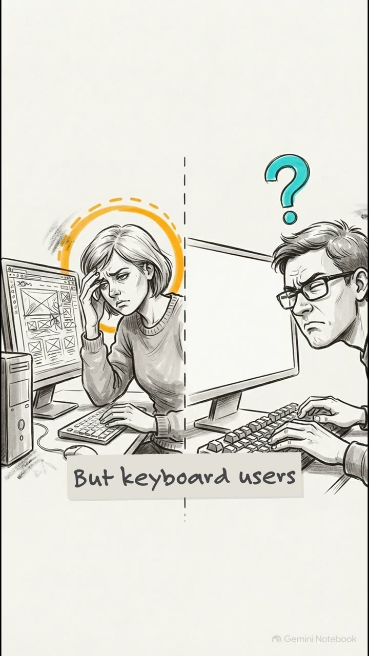
The physical stakes here are actually massive. For a switch access user, a missing skip link isn't just an annoyance. It translates directly to physical pain and fatigue. Forcing someone to press a switch 28 times just to get past the global header on every single lesson.
That is simply an unacceptable barrier. Our visual tests is equally critical. When you zoom in 400% on a standard viewport, giant sticky headers will actually illegally obscure our keyboard focus.
They just swallow the active element whole. We fix this by unsticking the header at smaller heights, and we must leverage the CSS scroll padding top property. That guarantees that when a keyboard user tabs down, the browser scrolls that focus ring fully into view below any overlapping elements.
Finally, section six, checklist and refactoring exercise. Your architectural blueprint. This right here is your exact granular toolkit for moving away from broken div soup today.
Add those skip links, use uniquely labelled nav landmarks, replace fake div buttons with native HTML button tags, check your accessible name cascades, paint unmistakable dual band focus visible rings, add your scroll padding top, and banish positive tab index from your code base forever.
Seriously, never use it. But as we tee up our next explainer on visual and cognitive accessibility, I'm gonna leave you with this. You've built the roads and the street signs, but will your application's architecture actually withstand the complexities of cognitive processing and visual tracking?
We'll tackle that exactly next time. Thanks so much for joining me on this Explainer.