Visual & Cognitive Resilience
Transcript
Made automatically from the video's sound, so it may contain mistakes. Click a line to play from there.
Welcome to the Explainer. So, with our season 10 episode 2, semantic landmarks, reading order, accessible names, and focus indicators well and truly locked in. It's time for us to level up.
Whether you're a designer, a front end or mobile engineer, a PM, a QA tester, or just a vibecoder, this is for you. Today we're engineering visual, spatial, motion, and cognitive resilience across our pathway and operations desk platforms.
We are pushing way past basic visual hierarchy here, folks. We're building structural robustness that actually survives radical user adaptation. Right, let's look at today's game plan. We've got luminance and OS adaptation, fluid typography and spacing, cognitive clarity and predictability, motion, time and safety, and we'll wrap up with stress testing and code repair.
We're diving straight into this structured adaptation arc. And honestly, we're completely bypassing basic collar wheel theory today. Instead, we're focusing on what actually happens when users or their operating systems forcefully override our pristine CSS.
Chapter 1. Luminance and OS Adaptation. Surviving system overrides. You know, we often design in a bit of a vacuum, don't we?
We just assume everyone sees our beautifully subtle pastel interfaces exactly the way we do. But in reality, millions of users rely on system adaptations that literally strip out custom web colours entirely.
And this is exactly why relying on colour alone to convey meaning is just a massive failure point under WCAG 1.4.1. Let's think about our operations desk. If we use, say, a purely visual red dot to indicate an overdue row, a contributor using a screen reader is only going to hear row 4, pre-ANIA, enrolment hash 4821, active.
The visual cue, the silent countdown, completely missed. Now contrast that with our fixed verbatim assistive technology speech. Row 4, Priya Naia, enrollment hash 4821, status, overdue, action required, session expires in two minutes.
For a low vision or Deuteronomia contributor, that difference is absolutely night and day. So the crucial takeaway here is meeting that 3 to 1 minimum contrast ratio for user interface input borders and icons under WAC 1.4.11.
Text, of course, needs a 4.5 to 1 ratio, or ideally that 7 to 1 enhanced ratio under WAC 1.4.6. What this means in practice is upgrading our operations desk's pale overdue row tint, which was sitting at a ridiculously fragile 2.5 to 1 up to a robust 4.8 to 1 icon and text batch.
Because at the end of the day, if users can't actually see the borders of your input fields, they simply can't use them. It's that simple. Now to make sure those inputs don't just vanish in high contrast mode, we use the forced colours active media query.
When a user has this active, your custom CSS colours are gone. Just poof, gone. To fix this, we map our borders to safe system keywords like button text and canvas text, and we use the current colour keyword for our SVGs.
Paired with the prefers contrast more query, this completely guarantees that the structural integrity of our inputs stays perfectly visible, even when the OS forcefully strips all our branding away. Moving right along to chapter 2, fluid typography and spacing, building spatial resilience.
Because you see, it isn't just about colour. It's about what happens when the physical dimensions of our text change dramatically for users who actually need magnified interfaces. Under the WCAG 1.4.10 reflow standard, our layouts absolutely must survive a 400% zoom.
They need to stack content down to a single 320 CSS pixel column for single-axis reflow, whilst also surviving a basic WCAG 1.4.4 to 100% text resize. Think about it. If a user has to scroll horizontally just to read a single line of text, we've fundamentally failed.
Oh, and if you've got a greedy, sticky navigation header, acting like some sort of real estate baron swallowing up 72% of the viewport height, your user literally has no screen left to read anything. Seriously, unstick those headers.
Thinking about how we structure our code, replacing fixed heights with min height is absolutely vital for protecting our dyslexic learners who might apply the WCAG 1.4.12 text spacing bookmarklet. Those specific overrides forcefully expand line heights to 1.5 times, paragraph spacing to two times, and they bump up letter spacing by 0.12Ms and word spacing by 0.16Ms.
If your code relies on height 180 pixels combined with overflow hidden, all that beautifully expanded text is going to clip and become completely unreadable. But by using min height and actually allowing the text to wrap, it expands beautifully, just as it's supposed to.
Okay, chapter 3. Cognitive clarity and predictability. Engineering for the mind. Cognitive accessibility gets overlooked far too often, honestly.
But whether it's temporary or permanent cognitive differences, from ADHD right through to just severe sleep deprivation, it drastically changes how users process our apps. So for our neurodivergent or ADHD contributors, evaluating against the W3C COGA guidelines, we really have to avoid those dense, intimidating walls of text.
We use vital chunking and plain language strategies to keep the Pathway app humane and approachable. But we also need predictable support. This means we're implementing WCAG 3.2.3 for consistent navigation, 3.2.4 for consistent naming conventions across the board, and 3.2.6 to make sure help is always found in a consistent spot.
Just by visually differentiating these sections, we can drastically reduce cognitive load. The absolute golden rule here processes must never, ever rely on user memory. We design our forms to actively prevent mistakes and to limit interruptions.
If a user steps away to grab a cup of tea or gets distracted by a random notification, they shouldn't come back to a blank screen, having lost all their hard work. That's incredibly frustrating. Clear labels, step-by-step instructions, and automatically saving state, these aren't just nice to have.
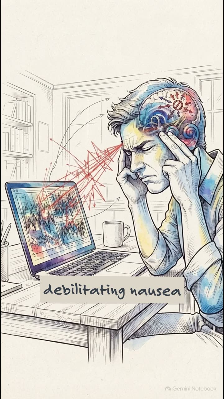
They are absolute game changers for usability. Which brings us to chapter 4. Motion, time and safety, protecting user attention and health. Now, did you know that by age 40, over 35% of adults will have experienced some form of vestibular dysfunction?
That means what we might consider a delightful bit of animation can actually make someone physically ill. Content must never flash more than three times per second under WCAG 2.3.1. This is a strict, non-negotiable threshold to protect users from photosensitive seizures.
It's estimated that roughly 3% of people with epilepsy suffer from photosensitivity. So this is absolutely not a design suggestion. It's a hard literal limit for basic human health and safety. Just never exceed this threshold, ever.
For a contributor with vestibular Migraines, who's evaluating our pathway app, we have to honour WCAG 2.3.3, and that prefers reduced motion, reduce media query. Look, when an operating system flags that a user prefers reduced motion, it is our duty as engineers to strip out all that non-essential zooming, spinning, or those nauseating parallax sweeps.
The fix, default to simple opacity fades, or honestly, just use no animation at all. Now, let's talk about timeouts, because there are another huge barrier. Instead of some 60-second auto-dismissing banner that logs a keyboard user out whilst they're mid-tab, we must implement the WACAG 2.2.1 steps.
We need to provide extendable timeout warnings with at least a 20-second buffer. And crucially, we have to make it instantly reachable via keyboard. Imagine just hitting the spacebar to extend session by 30 minutes. That ties directly back to our 3.2.6 consistent help patterns, keeping users from abruptly losing their data.
Chapter 5. Stress testing and code repair. The six condition exercise. Alright, it's time to bring all these concepts together and see how our code actually holds up when we throw literally everything at it simultaneously.
To upgrade our lesson cards and status badges so they survive our six-conditioned stress test, we have to layer some very specific CSS diffs. We apply a min height of 11 REM for those text spacing overrides. We add a one pixel solid var, border strong, that maps neatly to button text for high contrast environments.
And we swap out any intense animations for gentle opacity fades when reduced motion is preferred. By stacking these exact repairs, we end up creating a component that is fundamentally unbreakable.
You'll want to lock in this five-point checklist to guarantee your structural components possess true resilience, and pay special attention to that fourth point, defaulting carousels to paused under WECAG 2.2.2. That specifically ensures content doesn't abruptly shift around under a switch control scan box.
Oh, and don't forget your mobile users. Ensure voice control labels remain consistent per Wecag 3.2.4, and double check that AX5 dynamic type wraps cleanly without completely breaking your layouts. As we tee up season 10 episode 4, where we'll be diving deeply into forms and authentication, I want you to ask yourself how would your current inputs fare under these exact overrides?
Think about it. If a user forces high contrast, zooms to 400%, and alters text spacing all at the exact same time, does your login screen actually survive? Take this checklist back to your desk, break your UI on purpose, and then build it back stronger.
Thanks so much for exploring with me today, and I'll catch you in the next one.