What this article covers
A design note from ZumiLabs. Learn more in our free Digital Accessibility course.
We publish a thirteen-episode course on digital accessibility. Colour contrast is covered in episode 03. So it's a little embarrassing that the first draft of our new homepage had a button that failed it.
The button never shipped with the problem. But how it slipped in, and how it was caught, is a more useful story than the fix itself.
The button
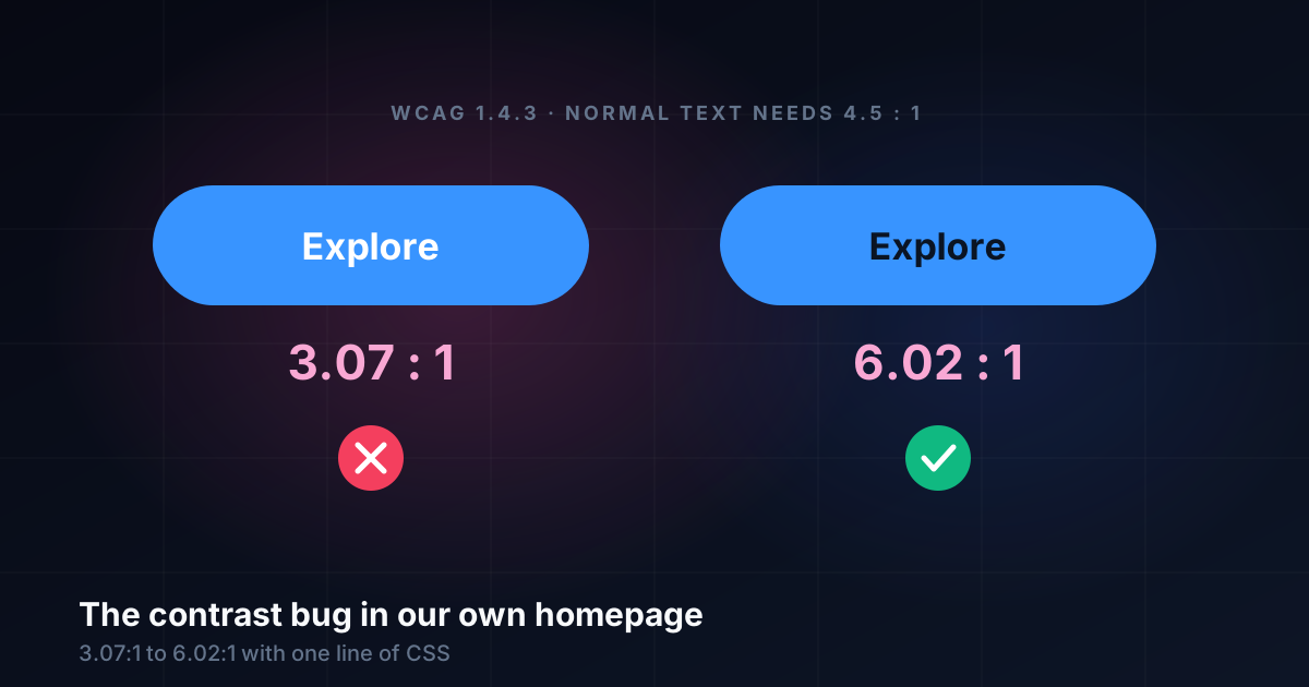
The new homepage hero had two buttons under the headline: "Explore the tools" and "Browse the guides". The first was a solid button in our tools blue, #3894FF, with white text. It looked crisp and bright, and on a dark page it read fine to the person who designed it.
The contrast check said otherwise:
| Text | Background | Contrast | Normal text (needs 4.5:1) |
|---|---|---|---|
| White | #3894FF | 3.07 : 1 | Fails |
#0A1424 | #3894FF | 6.02 : 1 | Passes |
What the rule says
WCAG 2.2 success criterion 1.4.3, Contrast (Minimum), asks for a contrast ratio of at least 4.5:1 between text and its background. Large text gets a lower bar of 3:1, and "large" means at least 24 CSS pixels, or about 18.7 pixels if bold.
Our button text was 0.95rem, about 15 pixels, at weight 600. That's normal text, so it needed 4.5:1. At 3.07:1 it would have passed only if it were nearly twice the size.
How the ratio is worked out
Contrast isn't about how different two colours look. It compares their relative luminance, which measures how much light each one gives off, weighted by how sensitive our eyes are to red, green and blue:
// Relative luminance of an sRGB colour (WCAG 2.x definition)
function luminance(hex) {
  const [r, g, b] = [1, 3, 5].map(i => {
    const c = parseInt(hex.slice(i, i + 2), 16) / 255;
    return c <= 0.03928 ? c / 12.92 : ((c + 0.055) / 1.055) ** 2.4;
  });
  return 0.2126 * r + 0.7152 * g + 0.0722 * b;
}

// Contrast ratio: (lighter + 0.05) / (darker + 0.05)
function contrast(a, b) {
  const [hi, lo] = [luminance(a), luminance(b)].sort((x, y) => y - x);
  return (hi + 0.05) / (lo + 0.05);
}

contrast('#ffffff', '#3894FF'); // 3.07
contrast('#0A1424', '#3894FF'); // 6.02
Our blue has a relative luminance of about 0.29. That's the trap: it's a mid-tone. It looks vivid and fairly dark next to a near-black page, so white text seems like the obvious choice. But green carries most of the weight in the formula, and this blue contains a lot of it. Measured, it sits closer to white than it looks, and dark text contrasts with it twice as well.
How it was caught
Not by looking. The draft was checked in a real browser at desktop and phone widths, in light and dark themes. Every screenshot looked fine.
It was caught because the review included a step that doesn't rely on eyes: reading the button's computed text and background colours in the page and calculating the ratio. That takes seconds, and it's the only check that doesn't depend on the reviewer's eyesight, screen or lighting.
Two ways to fix it
With a failing pair, you can change either colour:
- Keep white text, darken the blue.
#1F6FD6with white gives 4.88:1, and#2563EBgives 5.17:1. Both pass, but the button no longer matches the tools colour used everywhere else. - Keep the blue, use dark text.
#0A1424on our blue gives 6.02:1, well clear of the threshold.
We chose dark text. It kept the brand colour, and it matched the site's existing primary button in the header, which already used near-black text on the same blue. The fix was one line of CSS.
The twist
The buttons didn't ship at all. In the next review they were taken out because they took up too much vertical space above the carousel. The headline now does the job alone.
That doesn't make the check wasted. The same colour pair could easily have turned up elsewhere: a badge, a tag, a call to action on another page. Knowing that white on our tools blue fails at normal sizes is now a rule for the whole site, not a one-off fix.
What we took from it
Measure, don't eyeball. Contrast that looks fine on a good screen in a dark room can fail for someone else.
Be suspicious of mid-tones. Bright blues, greens, oranges and teals often fail with white text, even when they look dark.
Check new colour pairs, not just new pages. Most contrast bugs arrive with a new combination, not a new layout.
Write the result down. "Our tools blue takes dark text" saves every future review the same calculation.
Digital Accessibility, a free video course
Thirteen episodes on keyboards, screen readers, 400% zoom, contrast, forms, testing and more, each with explainers, audio overviews and transcripts.
Start the course