What this article covers
A design note from ZumiLabs. Try it: open zumilabs.com on a phone.
Our site header has seven links (Tools, Studio, Articles, Learn, Games, Art and For Teams), a theme switch and an "Explore everything" button. On a wide screen they all fit on one line. Below 1,100 pixels they don't, and the header did what most headers do: it hid every link behind a burger menu.
On a phone, that left the logo, a theme icon, a menu icon and one bright blue button. The two places most visitors want, the tools and the courses, were each two taps away, and the most prominent thing in the header was a call to action.
What we wanted
- Tools and Learn always visible, at every width down to the smallest phones. They match the homepage headline, "Local-first tools and practical guides", so the header should offer both.
- A quieter call to action on smaller screens, so it supports the page instead of competing with it.
- No sideways scrolling, ever.
- No HTML changes, because the same header appears on more than fifty pages.
Two links without touching the HTML
The header's links are one list. Below 1,100 pixels the old CSS hid the whole list and the burger opened it as a panel. The new CSS keeps the list visible while the panel is closed, and hides every link in it except two:
@media (max-width: 1100px) {
  .nav { grid-template-columns: auto 1fr auto; }

  /* While the menu is closed, show the list inline… */
  .nav-links:not(.mobile-open) {
    display: flex;
    grid-column: 2;
    justify-content: flex-end;
  }

  /* …but only Tools and Learn. */
  .nav-links:not(.mobile-open)
    a:not([href$="/tools/"]):not([href$="/content/"]) {
    display: none;
  }
}
The links are chosen by their address, using [href$="/tools/"] (an address ending in /tools/), not by their position or text. That works on every page, whether the link is written as /tools/ or as a full address, and it doesn't break if the order of the menu changes. When the burger opens the full menu, the :not(.mobile-open) condition stops applying and every link appears as before.
A quieter call to action
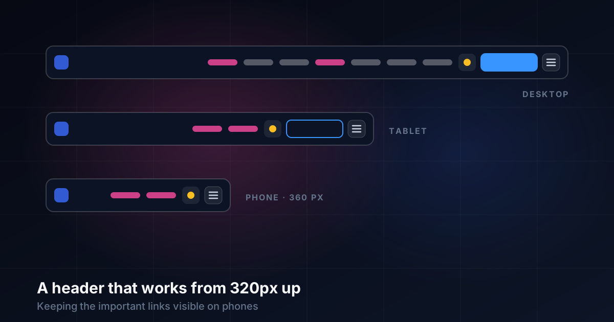
"Explore everything" is a filled, glowing blue button on desktop, where the header has room for it. On smaller screens it now changes with the width:
| Width | Links shown | Explore button |
|---|---|---|
| Over 1,100 px | All seven | Filled blue, as before |
| 641 to 1,100 px | Tools, Learn | Small outline in the panel colour, no glow |
| 640 px and under | Tools, Learn | Hidden: the links and the menu already go everywhere it does |
On a phone, the header is now the logo, Tools, Learn, the theme switch and the menu. Nothing in it shouts.
The 21 pixels
The first version looked right in the code and wrong on a 360-pixel phone. Measured in the browser, the page was 381 pixels wide: the header was 21 pixels too wide, enough to push the menu button partly off the screen and let the whole page scroll sideways.
Nothing was obviously wrong. Each item simply had desktop-sized spacing, and five items with desktop spacing don't fit in 360 pixels. The fix was a set of small reductions under 480 pixels:
- the gap between header items, from 12 to 8 pixels
- the gap between the logo and its wordmark, from 12 to 8
- the side padding on Tools and Learn, from 10 to 7
- the side padding on the theme and menu buttons, from 14 and 12 to 10
Together that saved more than 21 pixels without making anything feel cramped. Below 340 pixels, on the narrowest phones still in use, the "ZumiLabs" wordmark is hidden too. The flask logo stays and still links home.
Testing every width
Screenshots weren't enough to catch the 21 pixels. At a glance the header looked fine, and the overflow only showed if you dragged the page sideways. So each width was checked with a measurement as well as a screenshot:
({
  pageWidth: document.documentElement.scrollWidth,  // must equal…
  viewport: innerWidth,                             // …this
  visibleLinks: [...document.querySelectorAll('.nav-links a')]
    .filter(a => a.offsetParent).map(a => a.textContent)
})
We checked at 320, 360, 390, 820 and 1,280 pixels, on the homepage and on an article page, and opened the burger at phone width to confirm the full menu still worked. Every width ended with page width equal to viewport width and Tools and Learn visible.
One trap along the way: the browser had cached the old stylesheet, so the first check showed no change at all. Forcing a fresh copy of the CSS before measuring saved us from "fixing" code that was already right.
What I would tell someone doing the same
Choose the two or three destinations that matter and keep them out of the burger. A burger is fine for the rest.
Scale the call to action with the screen. Something that balances a wide header can dominate a narrow one.
Select by address, not position. It survives reordering and doesn't need HTML changes.
Measure overflow; don't just look. Compare the page's scroll width with the viewport at every width you support.
Test at 320 pixels. If it works there, it works almost everywhere.
UX Laws and Principles, a free video course
Including Fitts's law, target sizes and thumb zones: the reasons Tools and Learn deserve to stay within easy reach on a phone.
Start the course