What this article covers
A design note from ZumiLabs, drawn from our free UX Laws and Principles course.
Ask a room of designers for a UX law and someone will say Hick's law: the more options you give people, the longer they take to decide. It's used to justify short menus, hidden settings, fewer plans on a pricing page and the "magic" limit of seven navigation links.
The experiments behind it measured something much narrower. And two related beliefs, that choice paralyses people and that everything must be three clicks away, hold up even less well.
What Hick actually measured
In 1952 the psychologist William Edmund Hick ran a choice reaction experiment. People faced a set of lamps, each with a matching key. When a lamp lit, they pressed its key as fast as they could. Hick varied the number of lamps and measured the reaction time.
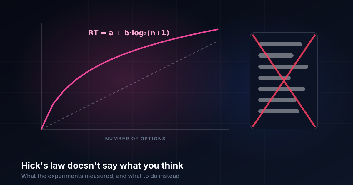
Reaction time grew with the number of choices, but not in a straight line. It followed a logarithm:
RT = a + b · log₂(n + 1)Doubling the number of equally likely options added a roughly constant amount of time, not double the time. A year later Ray Hyman showed that what really mattered was uncertainty, in the information-theory sense. When some options were far more likely than others, people were faster, even with the same number of options.
Notice what this setup is: a practised, one-to-one mapping from stimulus to response, taking well under a second, with every option known in advance. That's the narrow situation the formula describes.
Where it applies
Hick's law is a good model when the situation looks like Hick's lamps:
- A user knows the options well and picks by recognition: a familiar toolbar, a keyboard shortcut, a short list they've used many times.
- The decision takes less than a second or so.
- The options are clearly distinct and there is nothing to read, compare or evaluate.
In those cases the logarithm is good news: adding options costs little time, especially if the common ones are most visible.
Where it doesn't
Most real choices in an interface aren't like that:
- Scanning an unfamiliar menu is a search, not a choice reaction. People read items one after another, so time grows roughly in line with how many items they read before finding the one they want. The order and the labels matter far more than the count.
- Comparing options, such as plans, products or settings, is deliberation. It takes seconds or minutes and depends on how easy the options are to compare, not on how many there are.
- Finding something in navigation depends on information scent: whether each label clearly suggests the right next step.
So "seven menu items, maximum" isn't Hick's law at all. (It's often blamed on Miller's "magical number seven", which was about short-term memory, not menus.) A well-labelled, well-ordered menu of fifteen items can be faster to use than a vague one of five.
Myth: too much choice paralyses people
The famous evidence is a 2000 study by Sheena Iyengar and Mark Lepper. Shoppers saw a tasting table with either 24 or 6 jams. More people stopped at the large display, but far more bought from the small one: about 30% against 3%.
It's a memorable result, and it has been tested many times since. In 2010, Benjamin Scheibehenne, Rainer Greifeneder and Peter Todd pooled 50 experiments on choice overload. The average effect was close to zero. Choice overload happens under some conditions, such as options that are hard to compare, no clear preference or time pressure. But it isn't a general law that more options mean fewer decisions.
The design lesson isn't "show fewer things". It's "make the options easy to compare": consistent attributes, a comparison table, a sensible default, and groups that help people narrow down.
Myth: everything within three clicks
The three-click rule says users give up if they can't reach content in three clicks. It has been tested and doesn't hold. In a widely cited 2003 study by Joshua Porter, people's success and satisfaction didn't drop after the third click. Whether people succeeded depended on whether they could find their way, not on how many clicks it took.
Forcing everything within three clicks usually makes things worse: huge menus, crowded pages, vague labels. Several clear steps beat a few confusing ones.
What to do instead
- For frequent, quick choices, keep options stable and recognisable, and put the most likely ones first. This is where Hick's law genuinely helps.
- For navigation, write labels with strong information scent, group related items and order lists in a way people can predict.
- For comparisons, make attributes consistent, offer a good default and use comparison tables.
- For complex tasks, use progressive disclosure: show what most people need now, and let the rest appear when it's relevant.
- Test with real tasks, and measure time and success rather than counting options or clicks.
Episode 01 of our free UX Laws and Principles course, How People Choose, goes through all of this with the original studies, including a hands-on refactoring exercise.
UX Laws and Principles, a free video course
Eight episodes separating predictive models, real psychological effects and folk myths, across choice, movement, perception, memory, time, progress and trade-offs.
Start the course